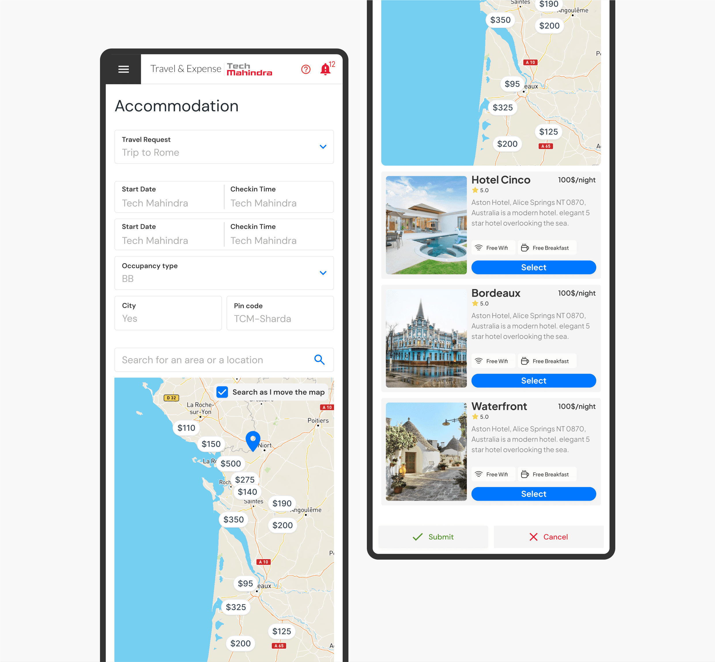
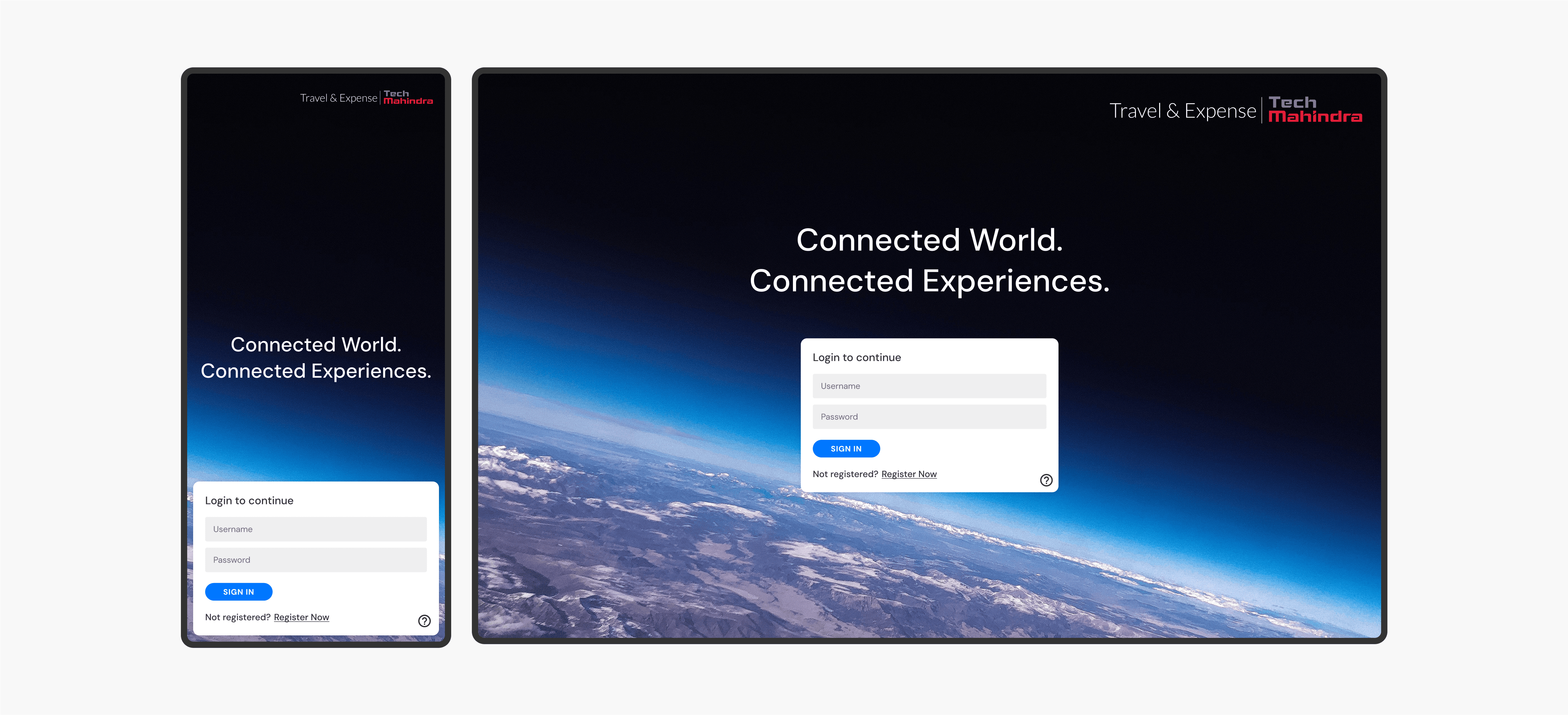
Tech Mahindra
A centralized travel & expense system for a company with 150,000 employees
Tech mahindra, founded in 1986 by Anand Mahindra is a multinational IT and consultancy company headquartered in india with over 146,000 employees in over 90 countries. It is a part of the Mahindra group. I worked with Tech Mahindra to build a travel and expense system that is being used by every employee across all roles within the company
Background.
Being a company that works in over 90 countries and with 146,000 employees, Travel and expense management forms a core part of the HR system of the company. Before TechM approached me for this prject, the company relied in an archaeic stystem built in the early 90s that handled this aspect. the usual turn around time for the smallest of requests like applying for a leave took atleast a week to complete. The biggest concern i had was the complexity of the system and making it accesible to all kinds of people from vastly varying demographics.
Before Tech mahindra even hired a product designer, a beta release of the new platform had been implemented based on blue-sky concepts executed through speculation internally. These mockups were created without any usability testing and had little consideration for the technical and product limitations on the scope of work.
Approach.
As a multinational company with hundreds of thousands of employees from diverse backgrounds and countries, my priority for the product was to ensure ease of use and localization. The tool needed to be intuitive for everyone, regardless of their origin or experience. To empathize with such a varied user group, I created "Proto-personas" based on my expertise and assumptions. These served as a starting point to understand user needs, challenges, and potential solutions. Subsequently, we created a large user group to conduct research, verify, and modify our assumptions about their pain points.
My research encompassed:
Understanding the user goals and needs
Uncovering pain points with the existing user journey
Determining the success of the tasks measured
Leveraging this research data, I developed a roadmap outlining the next steps through efficient brainstorming and prioritization. This plan focused not only on the final product's impact but also on how prioritizing certain features at different stages of the final design process would enable the product to be more useful.
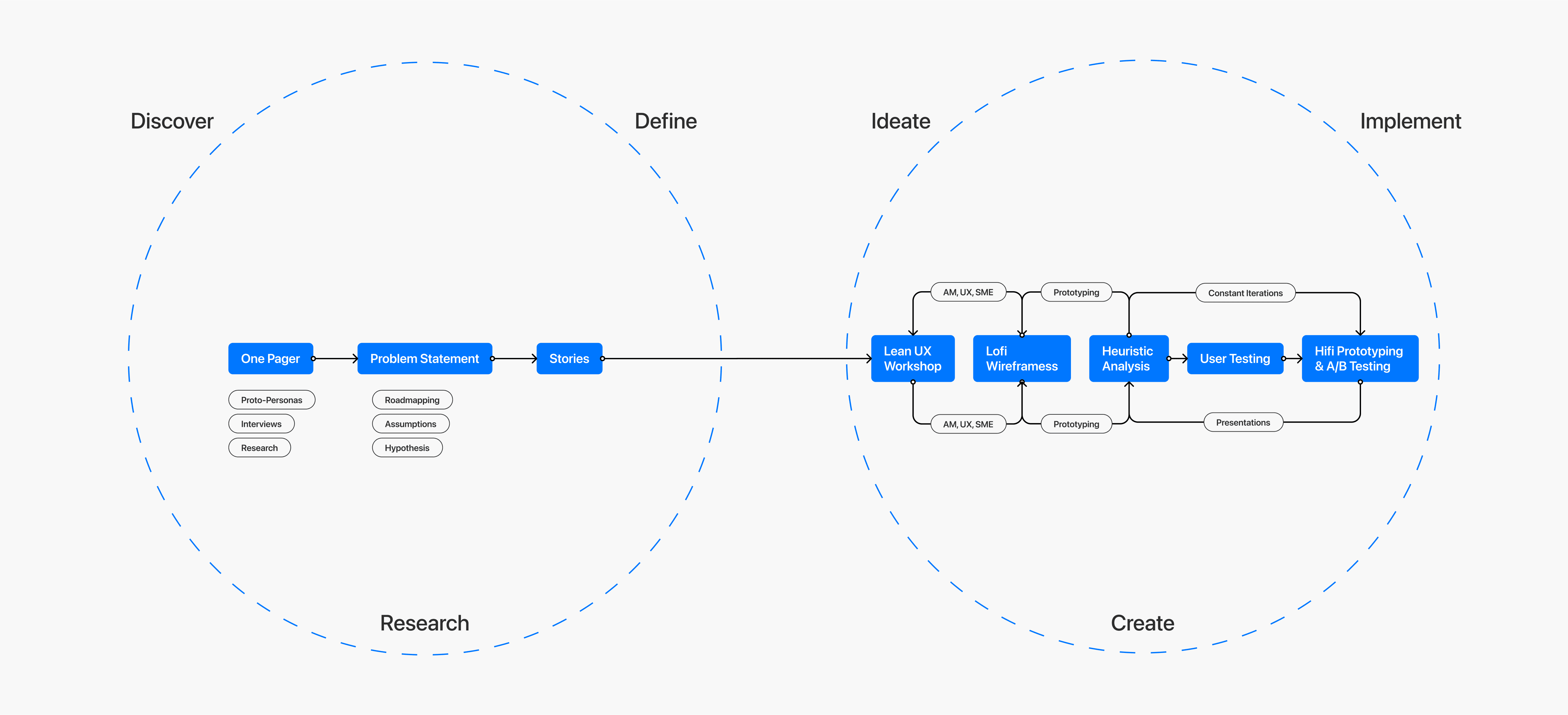
A modied version of the converging and diverging system in UX that allowed for speculative design and a more homogenous product lifecycle.
Impact.
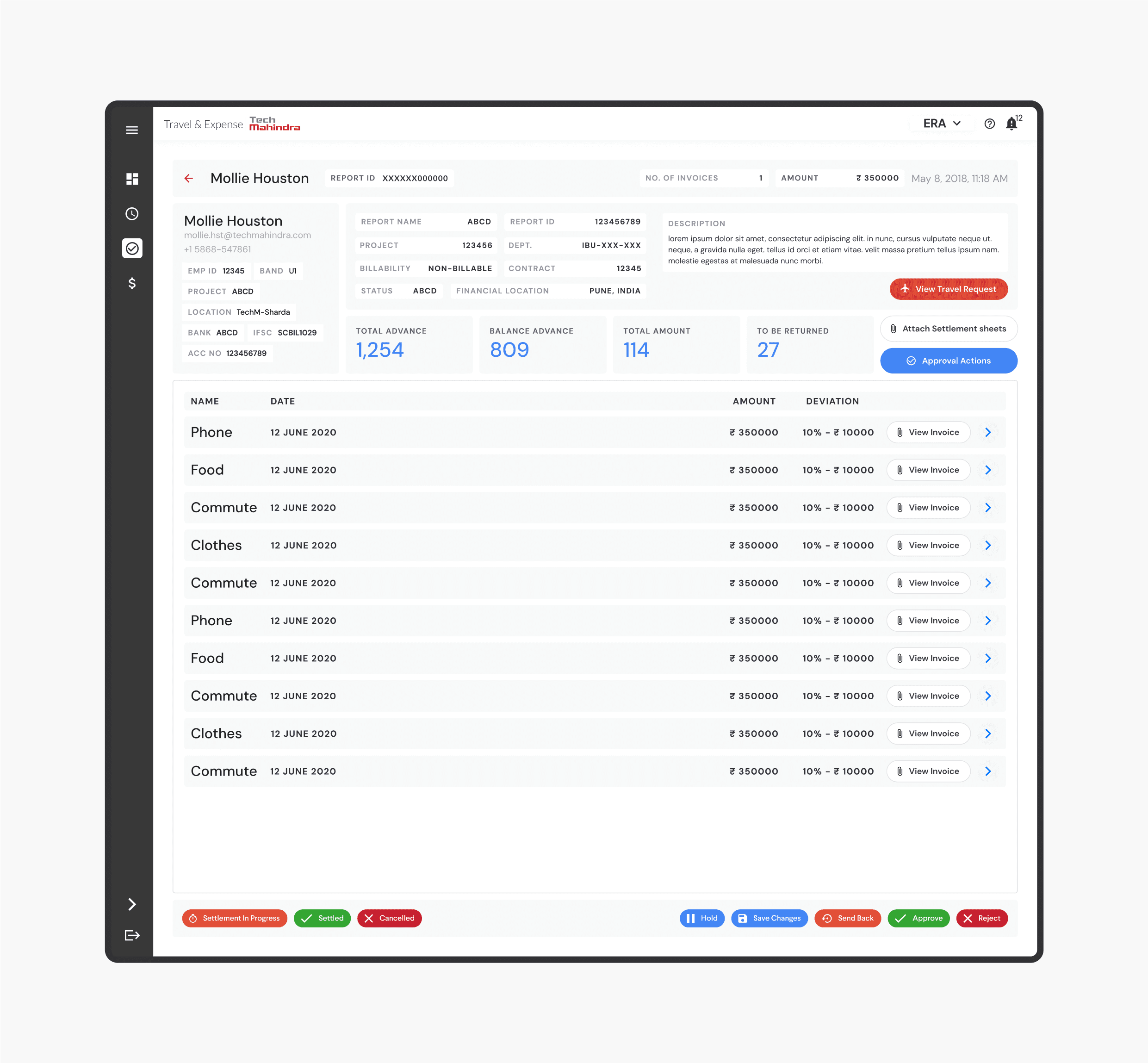
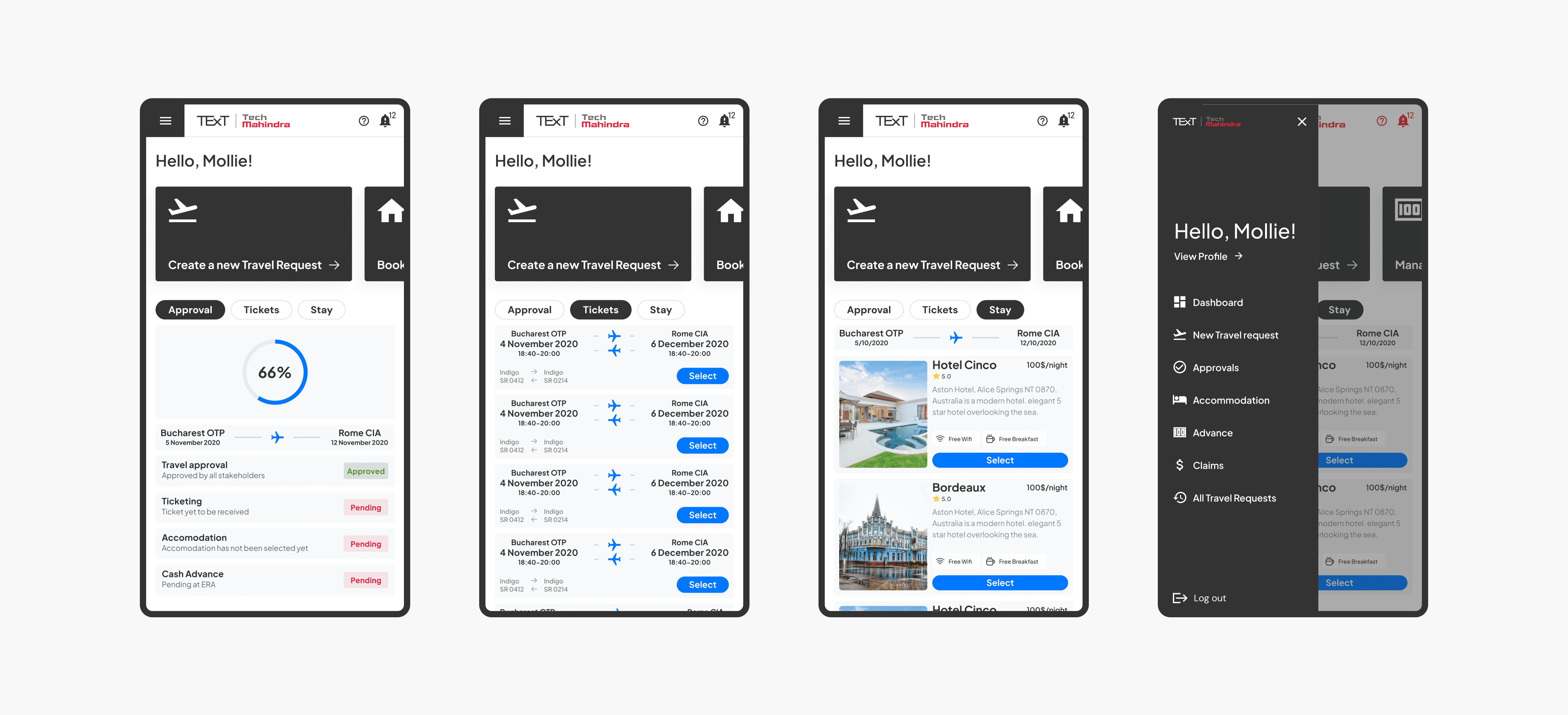
The released version of the dashboard was well-received by almost all users in the heuristic group and at release, with 90% user approval. Though a success, the team believed there was room for improvement. We considered this in the initial stages of project considering it's vastness.
The things that we iteravively improved on where:
Isolating the admin experience from the main user experience using a simple dropdown menu
Creating a centralized main navigation hub where users can reach all product aspects within two clicks.
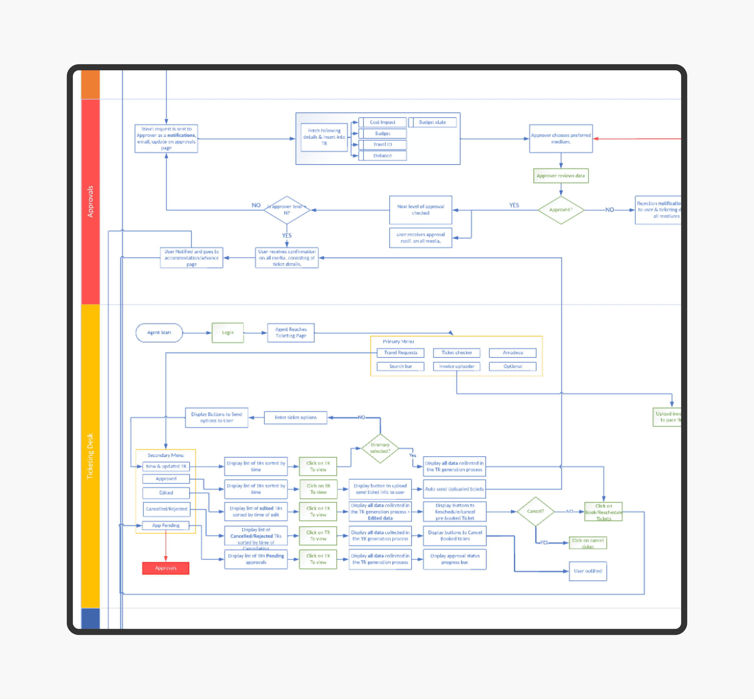
Replacing the progressive approval system with a parallel one to significantly reduce request cycle time.
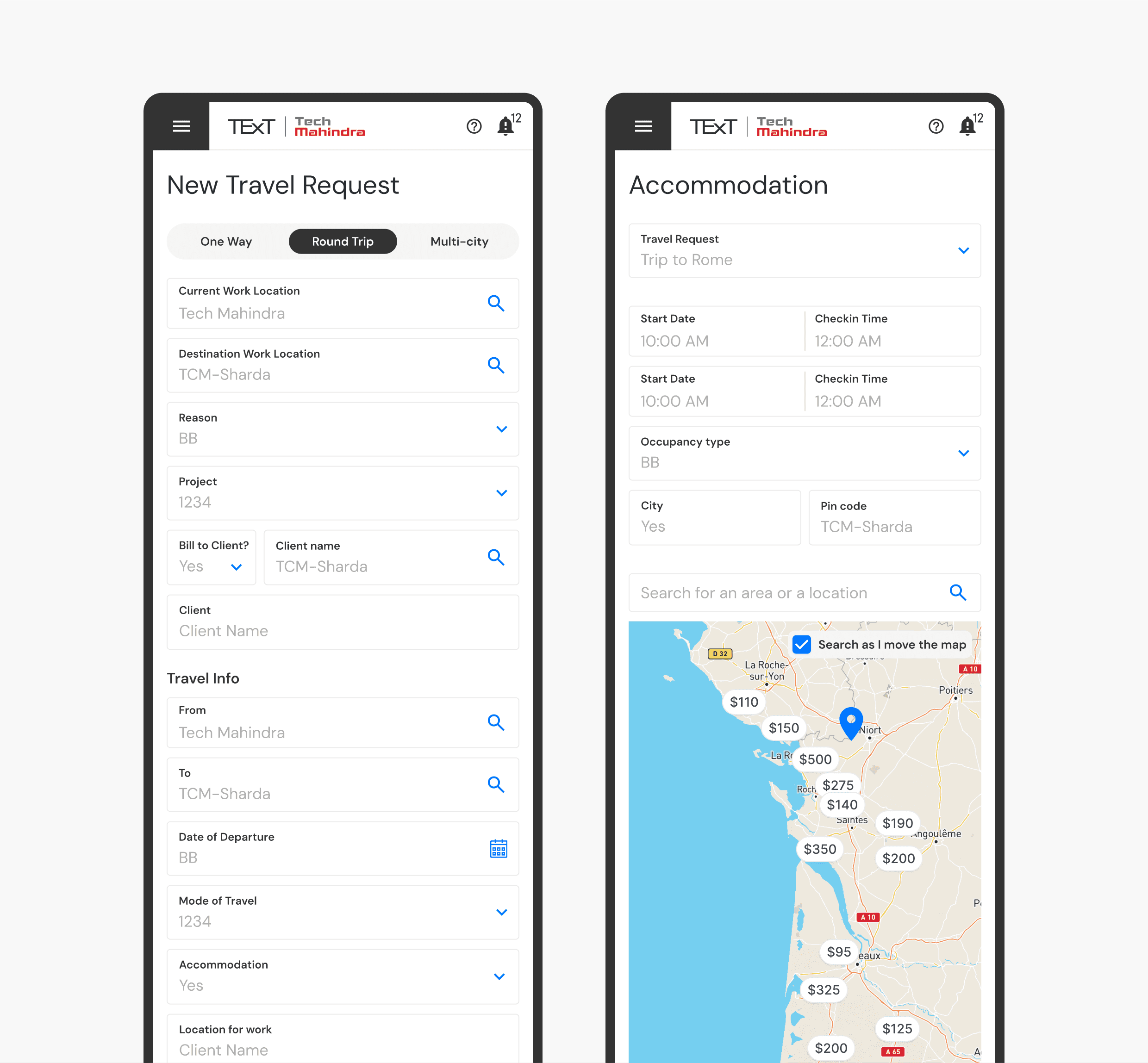
Since implementing the TeXT system rebuild, we've seen a significant decrease in service desk complaints. Users praised the simplified request approval process and creating requests in minutes, saving them substantial time.
Some key takeaways from this project are:
Create a strategic MVP plan to handle out-of-scope requests, preventing project derailment and delivering a quality product on time.
User testing is iterative. Design constantly improves the user experience. Always find ways to collect and listen to user feedback.
Involve engineering upfront to reduce rework. Understanding technical limitations early informs design strategy.
We built a foundation for further development, adding a home for global features like Quick Approvals for admins and a better archive system. Established patterns and designs will inform future product improvements as we continually strive to enhance the Event Organizers' experience.

