Supergoop
Enhancing the mobile and account experience for over 2 million customers
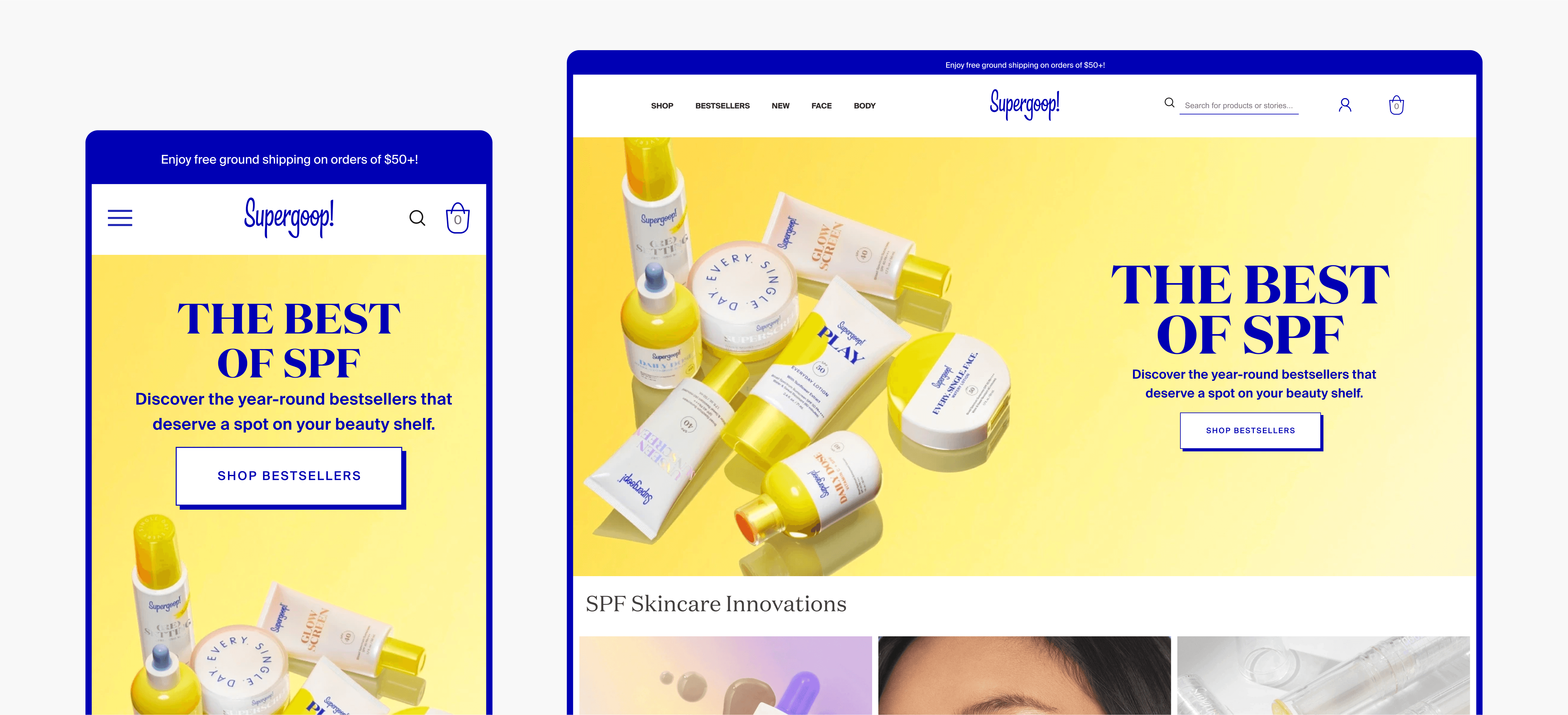
Supergoop! is a sunscreen-focused skincare brand making daily sun protection fun and accessible. They target sun-conscious millennials and Gen Z with innovative, enjoyable products like Unseen Sunscreen and Glowscreen. Their minimalist, warm branding encourages a positive view of SPF, and their commitment to clean ingredients and reef-safe formulas resonates with a growing audience. Supergoop! A who share a long time collaborative relationship with gammawaves, reached out to us to carry out a few tasks. They wanted us to review a bunch of aspects of the site and find ways to improve the general UX.
Background.
Initially Supergoop reached out to us to carry out a general audit of their mobile site to figure out a bunch of issues they were facing, some of those were:
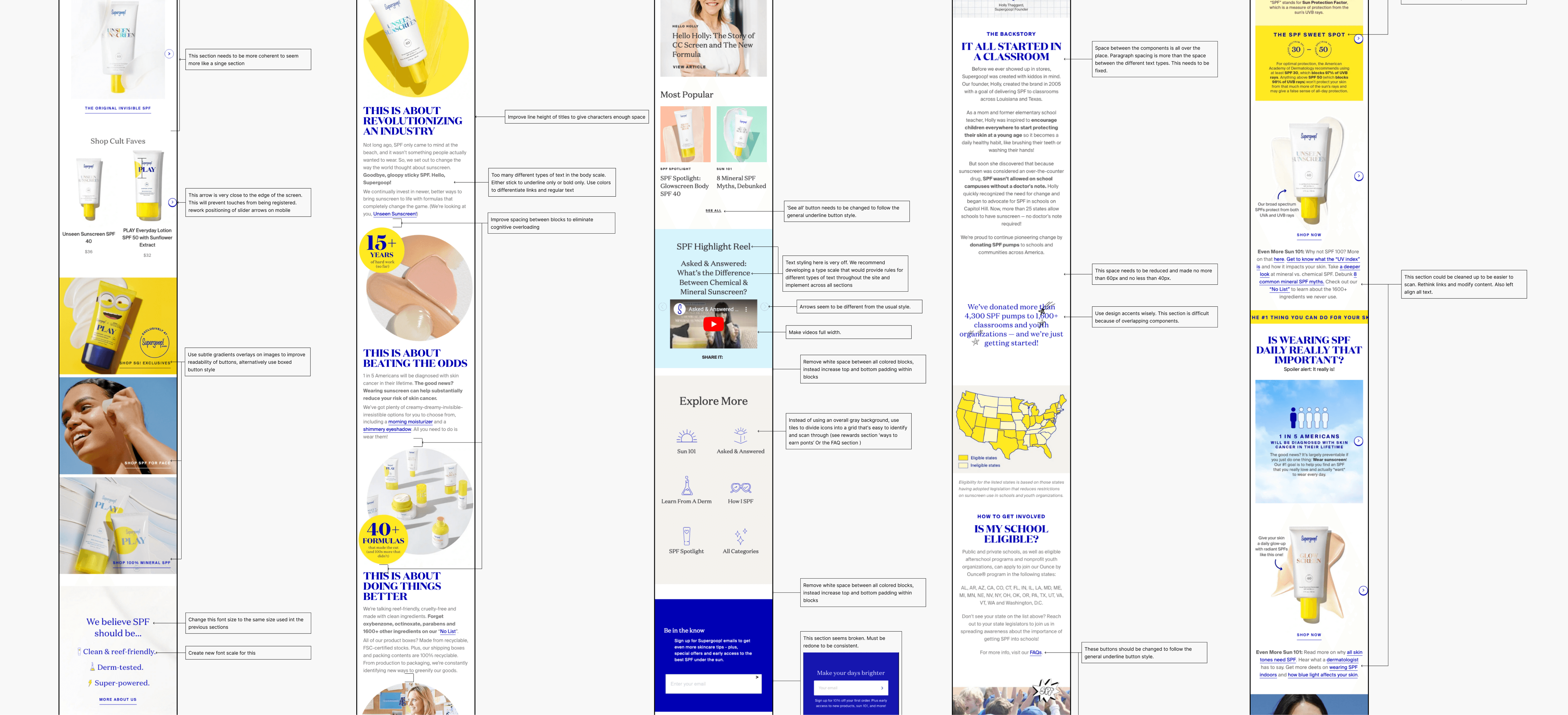
Mobile responsiveness: While Supergoop! has a mobile-friendly website, the user experience was not seamless. I was tasked with auditing their mobile designs to discover the potential issues with navigation, layout, or functionality specifically on mobile devices.
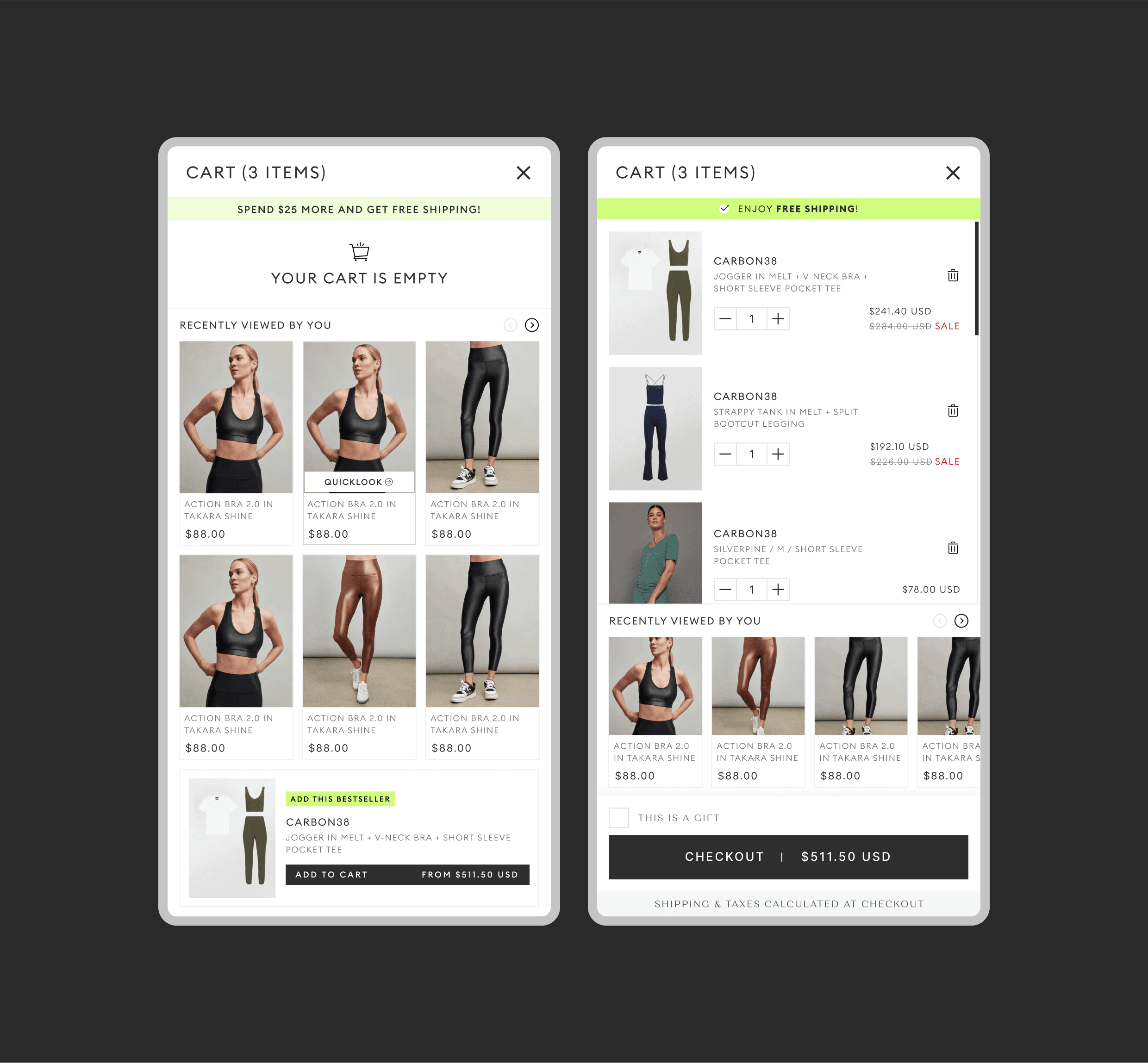
Cart abandonment: Updating the cart design implies potential issues with cart usability or clarity. Supergoop! was been seeing high cart abandonment rates due to confusing checkout flows, hidden costs, or lack of product information within the cart itself.
Quick-add friction: The need to clean up the quick-add feature suggests it might have been buggy, slow, or difficult to use. This could be leading to frustration and missed sales opportunities.
Account creation pain points: Creating a new user account system indicates potential problems with the existing system. Issues like lengthy registration processes, lack of social login options, or forgotten password complications could be deterring new users from signing up.
Overall user experience: While these specific tasks address individual pain points, they might be symptoms of a broader UX issue. Supergoop! might have been experiencing low conversion rates, negative user reviews, or difficulty engaging users on the site, prompting them to seek a comprehensive UX review from a trusted partner like Gammawaves.
Approach.
To tackle the Issues we discovered, we embarked on a multi-step UX design process where we tackled each issue individually.
We began by conducting user interviews and surveys to gain a deep understanding of their experiences with Supergoop!'s mobile browsing, checkout process, quick-add feature, and account creation process. This helped us identify specific pain points and areas for improvement. To learn from industry leaders, we conducted a thorough analysis of how other successful e-commerce websites handled similar features. This allowed us to identify best practices and potential areas for differentiation. We also delved into website analytics data to pinpoint areas with high drop-off rates or user frustration. This data-driven approach provided valuable insights and helped us prioritize improvement areas. Based on this discovered priority we carried out the following steps:
Mobile Optimization: We meticulously audited Supergoop!'s mobile design, identifying and addressing inconsistencies in layout, functionality, and responsiveness across various mobile devices. This ensured a seamless and consistent user experience regardless of the device used.
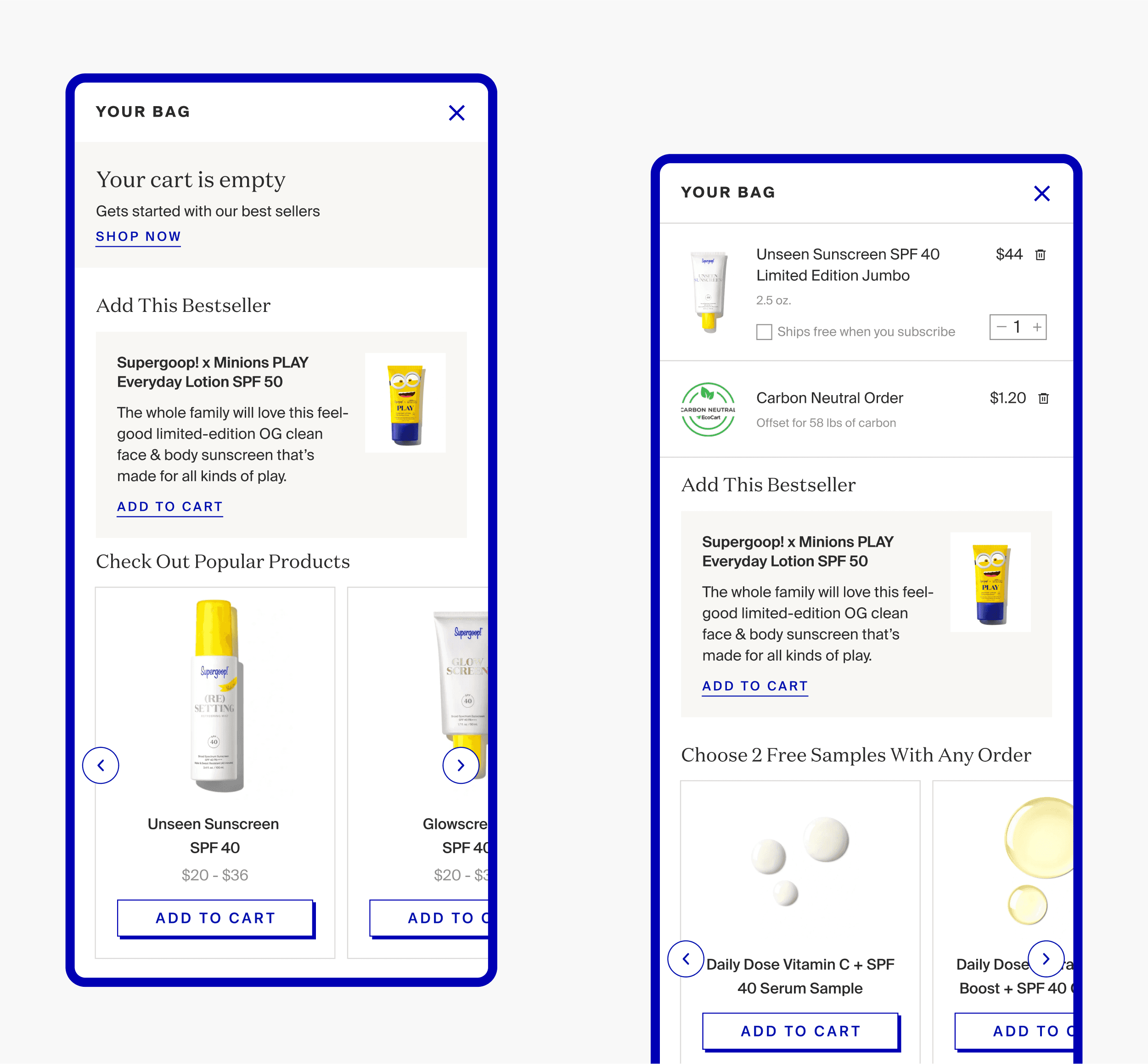
Streamlining Checkout: We redesigned the cart, focusing on creating a streamlined checkout flow with clear product information, visible costs, and diversified payment options. This included incorporating a guest checkout feature if needed, to cater to users who prefer not to create an account.
Revamping Quick-Add Feature: We focused on enhancing the usability of the quick-add feature by ensuring smooth functionality, allowing for customization of quantities and variants, and providing clear instructions for usage. Our goal was to make adding items to the cart a quick and effortless experience.
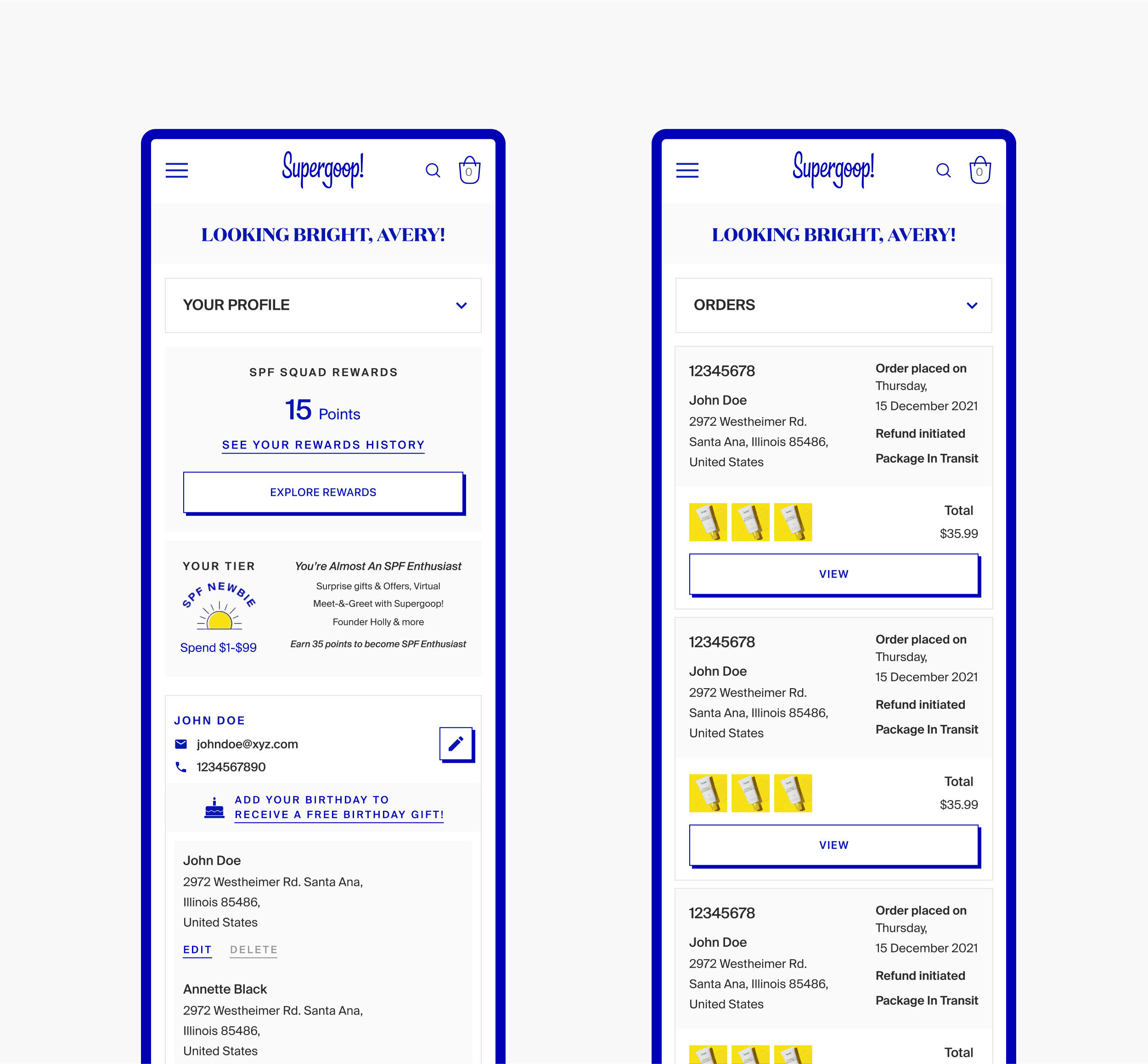
User Account System Overhaul: We designed a user account system with a user-friendly registration process, social login options, efficient password management, and personalized account features. This aimed to create a more engaging and valuable experience for users who choose to create accounts.
Iterative Design: We started by developing low-fidelity prototypes to test initial concepts and gather user feedback. Based on this feedback, we iteratively refined and improved the designs and functionalities until optimal usability was achieved.
Usability Testing: To assess the effectiveness and user-friendliness of the final design solutions, we conducted usability testing with representative users. This allowed us to identify any remaining issues and ensure the solutions truly addressed the identified problems.
A glympse of the indepth mobile audit highlighting UX issues that lead to a high dropoff rate
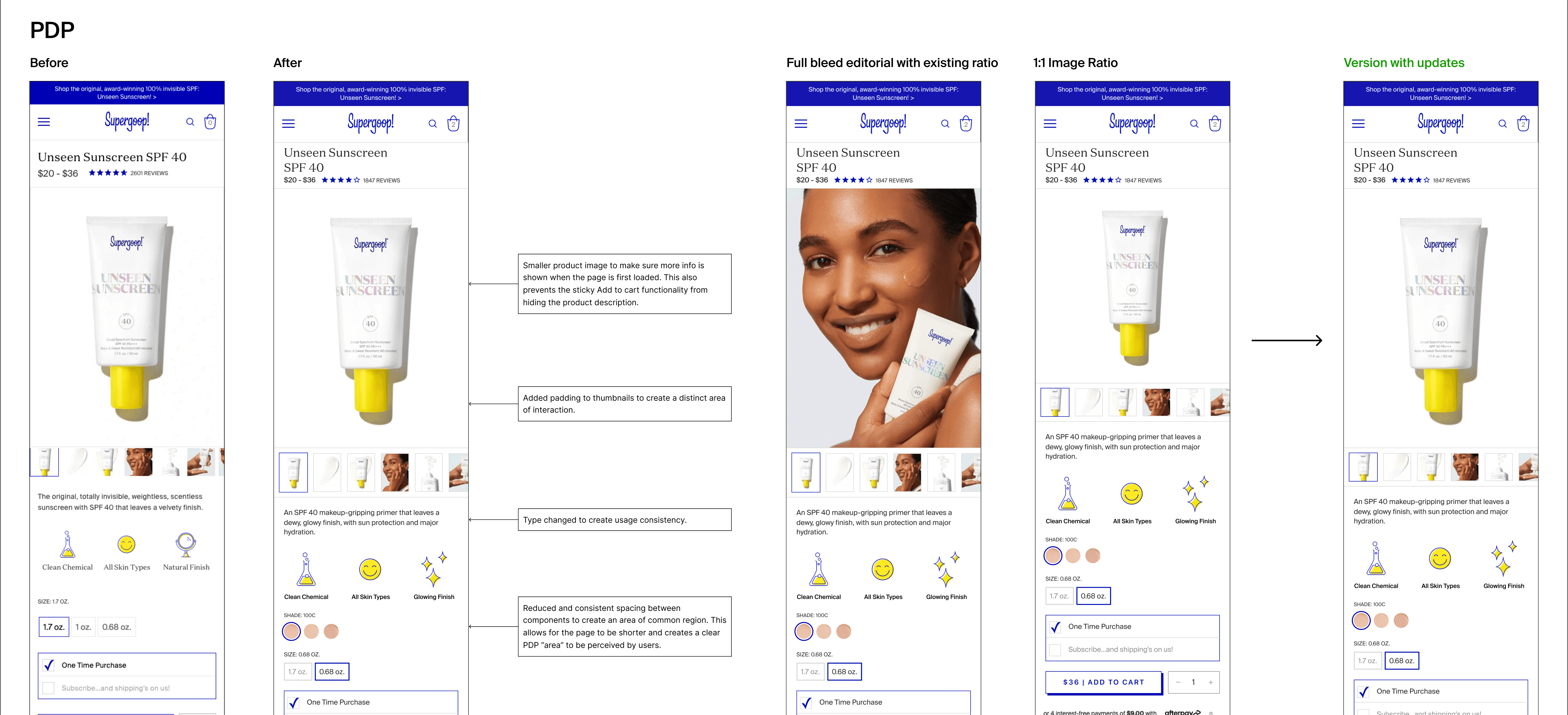
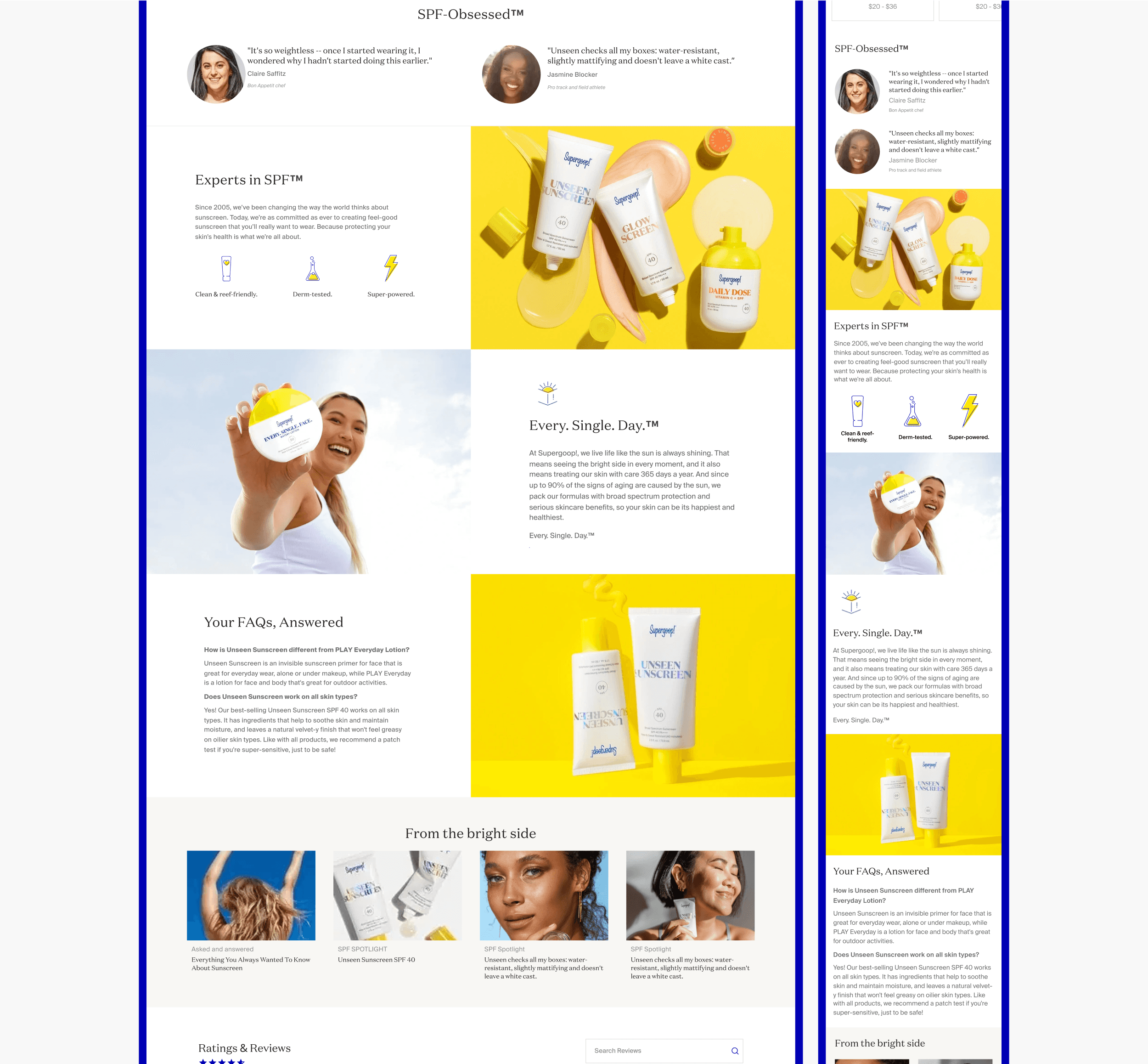
Example of how we delivered multiple design options with the reasoning behind the updates.
Impact.
Our collaborative efforts with Supergoop! to improve their website UX yielded significant results. We observed a 30% increase in total sales and a 26% rise in total orders, demonstrating a clear boost in user engagement and purchase behavior. While the overall conversion rate only increased by 2%, this is often accompanied by higher quality leads and potentially higher customer lifetime value. Addressing challenges like inconsistent mobile responsiveness, a confusing checkout process, and an inefficient quick-add feature likely contributed to cart abandonment and hindered user journeys. However, by streamlining the user experience, we facilitated a smoother buying process and ultimately contributed to Supergoop!'s success.
