CPA Ontario
A highly accessible knowledge gateway for the CPAs in Canada
CPA Ontario, a government-backed organization, serves and supports 100,000 members and 21,000 CPA students. It empowers them to access professional development and achieve qualifications in diverse positions across public accounting, business, finance, government, academia, and non-profit sectors. As the leading governing provincial body for CPAs in Ontario, CPA Ontario caters to a diverse professional landscape encompassing individuals from all adult age groups and speaking a multitude of languages. As the organization's core mission lies in supporting and educating such a diverse audience, we conducted a discovery session. This session revealed the crucial need for a platform offering accessible resources and certifications to all CPA Ontario members and students. Unsurprisingly, accessibility became the paramount priority for this project.
Background.
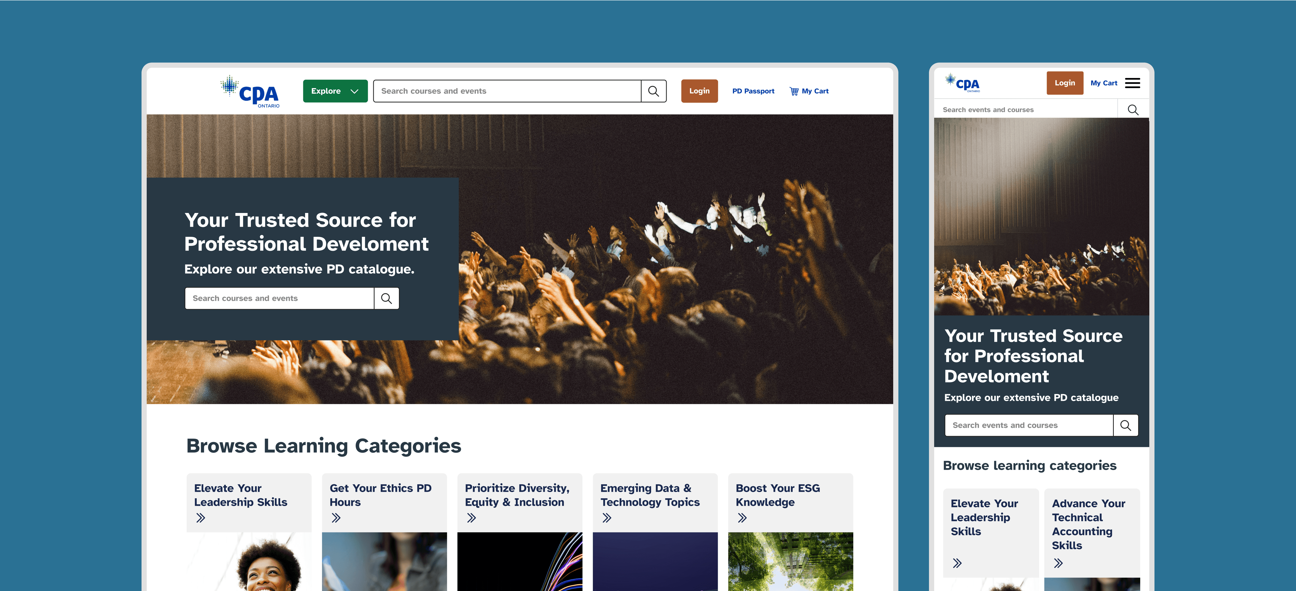
The CPA Ontario website serves as the primary portal for CPAs to access essential information for maintaining their professional knowledge and upholding the profession's standards. Ultimately, it protects the public interest while serving both its members and students.
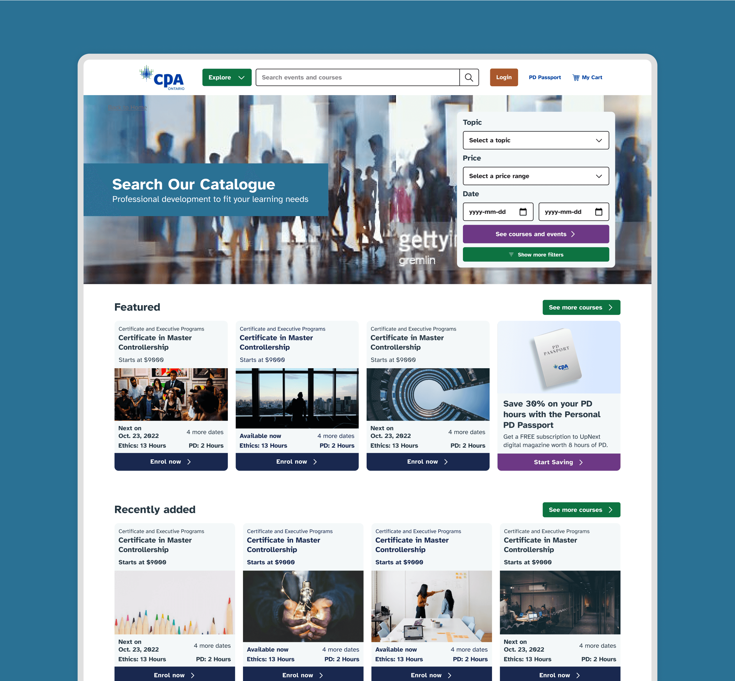
We envisioned the website as a centralized knowledge portal, offering courses and certifications to guide all members of the CPA community and support the ongoing development of both members and students. Accessibility was paramount throughout the entire development process. We aimed to create a website that caters to everyone, regardless of their abilities, technical skills, or preferred learning styles. This included features like:
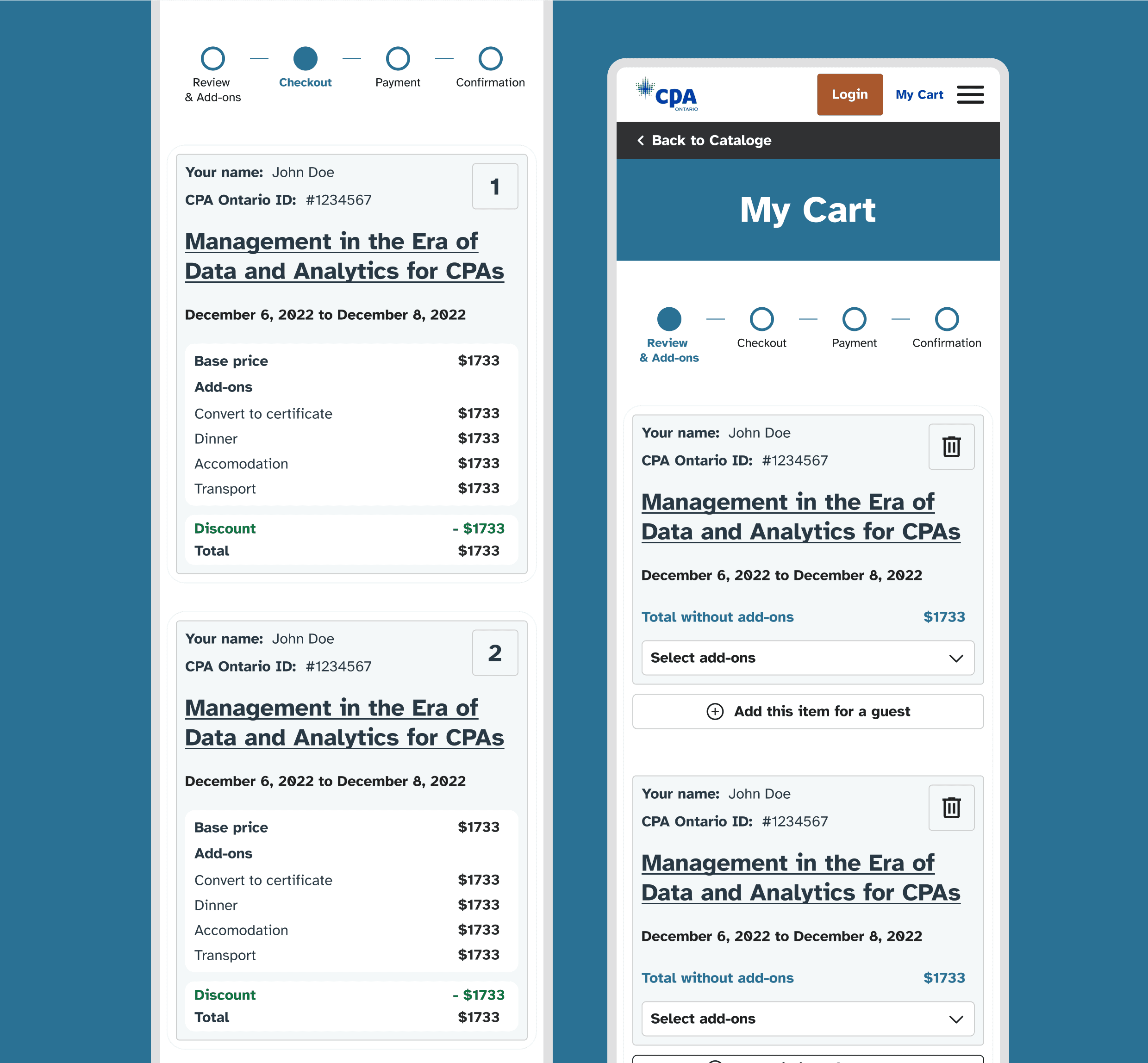
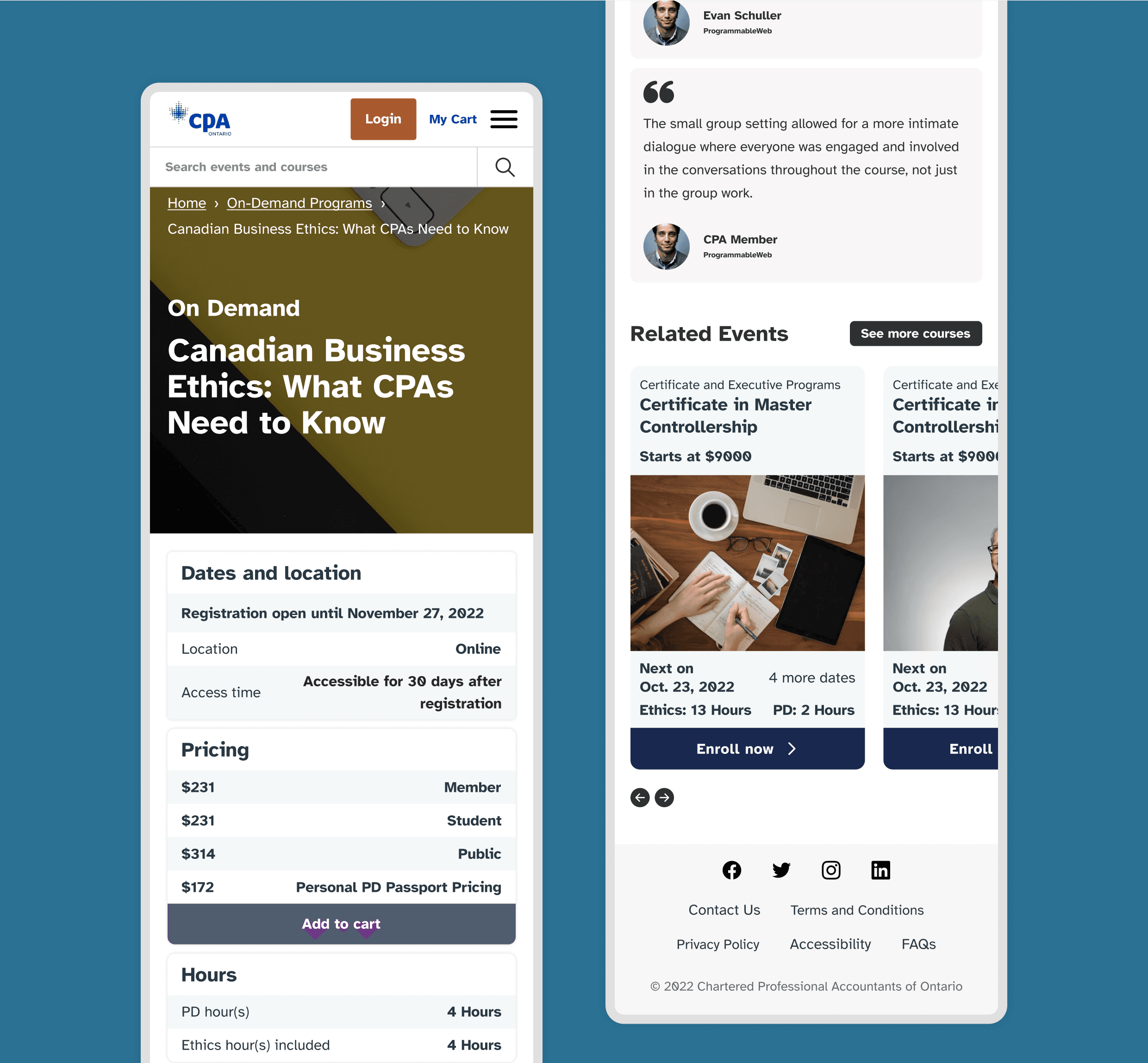
Responsive design for optimal viewing on any device
Screen reader compatibility for users with visual impairments
Clear and concise language for easy comprehension
Alternative text descriptions for images
Keyboard navigation for users who cannot use a mouse
Approach.
To truly understand the diverse needs of the CPA community, we embarked on a comprehensive research phase involving interviews with members and students across various demographics, experience levels, and learning styles. This in-depth approach allowed us to tailor the website's features and content to their specific requirements.
Here are some questions that illustrate the range of inquiries we explored:
For experienced CPAs: "What are your biggest challenges in staying current with ever-changing regulations and industry trends?"
For students: "What format would you find most helpful for learning complex accounting concepts? Do you prefer video lectures, written materials, or interactive quizzes?"
For members with visual impairments: "What accessibility features are most important to you when navigating a website? Are there specific tools or functionalities you rely on?"
For members with learning disabilities: "Do you prefer information presented in a concise and direct manner, or do you benefit from additional explanations and examples?
By incorporating these diverse perspectives, we aimed to create a website that caters to the individual needs of every CPA, regardless of their background or abilities. Accessibility was woven into the fabric of every design decision, ensuring that everyone has equal opportunity to access valuable resources and contribute to the profession's success. We created a novel method to
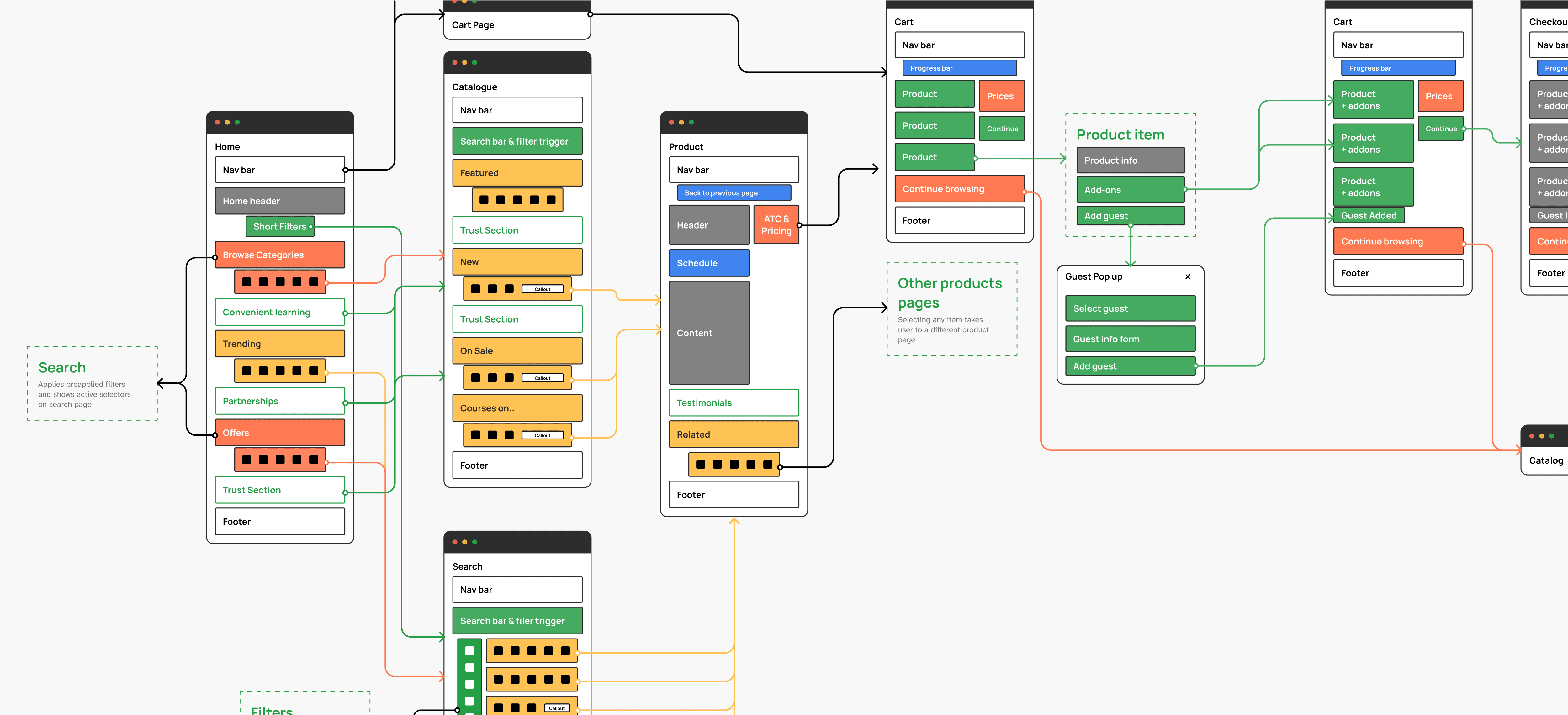
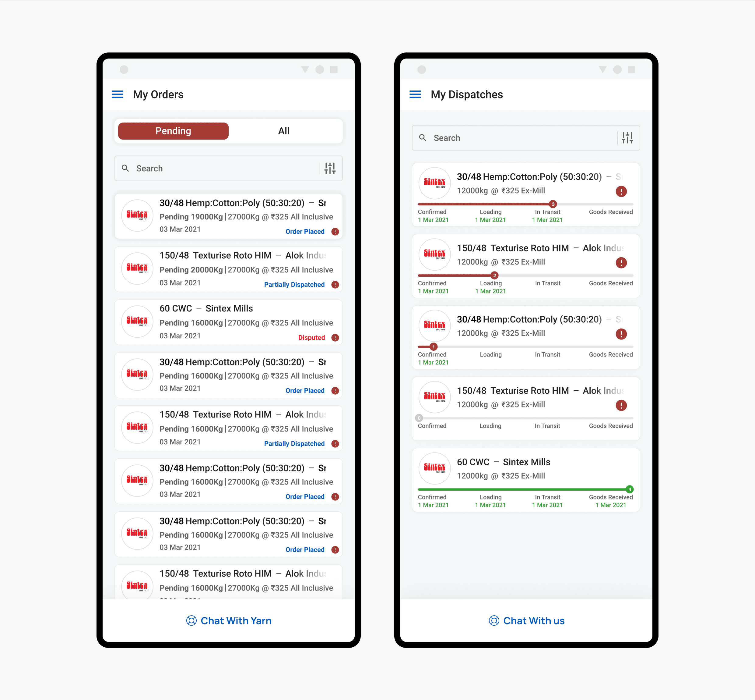
A glimple of the user and information flow diagram.
Impact.
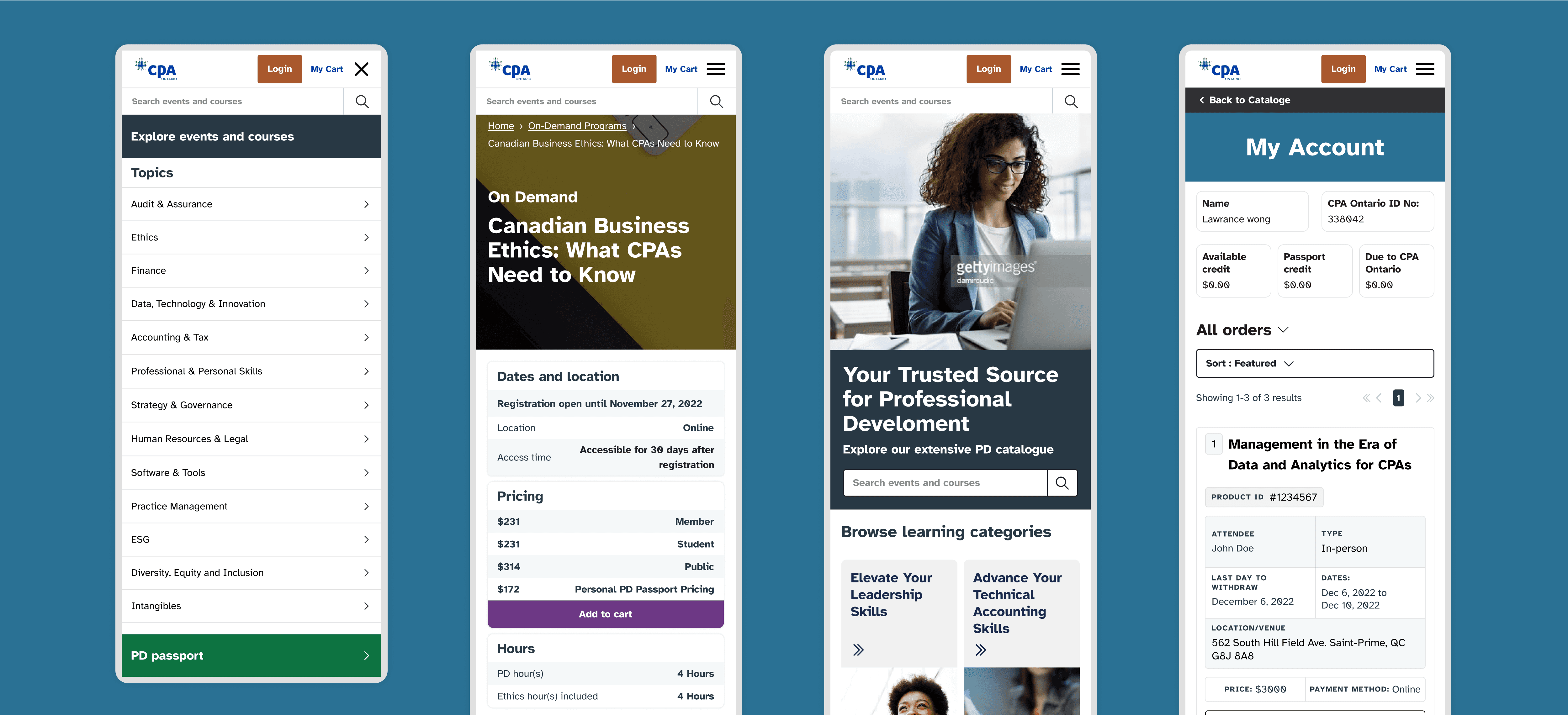
We created a portal where CPAs, regardless of experience, learning style, or ability, could effortlessly access the resources they need to thrive. By prioritizing accessibility, diverse learning formats, and a centralized platform for information, the website ended up being accessible to 1000s of new users. Post launch user feedback suggested that they enjoyed the smoother resource discovery, stronger community connections, and the unique subscription feature called Passport that allowed users to access all courses at a single, fixed cost.
By focusing on user-centered design principles and incorporating feedback throughout the process, we could create a website that is not only functional but also truly serves the needs and preferences of its diverse user base. This was by no means an easy project though, here are some of the hurdles we faced and how we approached each of them uniquely:
Accessibility vs. Usability: Balancing design appeal with comprehensive accessibility wasn't easy. Features like screen reader compatibility and keyboard navigation seamlessly integrated into an intuitive interface thanks to rigorous testing and consideration.
Diverse Audience: Tailoring the platform to various groups, from seasoned CPAs to recent graduates with diverse learning styles, was complex. We achieved the right balance between content depth and simplicity through user research and design iterations, offering a variety of learning formats like videos, quizzes, and articles.
Information Architecture: Organizing the vast resources clearly and intuitively was crucial. We implemented a user-friendly search function, effective navigation structures, and considered different user journeys to address these design challenges.
Community Engagement: Fostering a sense of community within the platform required thoughtful design elements. Discussion forums, gamification features, and personalized recommendations encouraged user interaction and engagement.
Accessibility & Feedback: Continuously testing with users with disabilities and incorporating their feedback was essential. This iterative approach ensured the platform remained accessible and usable for all.

