Another Tomorrow
Bringing sutainable luxury to the masses with an elevated shopping experience
Another Tomorrow, founded by Vanessa Hallik in 2018, is a sustainable fashion clothing company headquartered in New York City. They utilize a unique system of QR codes to provide transparent supply chain information. The company approached Gamma Waves (where I work as a subcontracted lead product designer) to create a detailed UX audit focused on improving consumer engagement. Additionally, based on the audit's findings, you implemented quick updates to verify the results and enhance the user experience.

Background.
When AT approached us, they had experienced a 40% drop in sales, primarily due to challenging site navigation and the lack of a flow within pages. We began with in-depth research on the user journey, analyzing key drop-off points. This helped us identify user pain points, assess whether the UX served the target demographic, and evaluate potential modifications for features with lower-than-expected utilization.
The sources of research data included HotJar reports to analize clicks, drop off poitns and page traffic. User interviews to understand what stopped them from finishing the purchase journey and finally visual analysis of the pages to point out obvious issues with the site.
Approach.
Understanding the People:
During initial research, I reviewed user interaction data to identify areas with high drop-off rates. In user interviews, I asked consumers to recall and walk me through their initial experience navigating the site and attempting a purchase. I also inquired about their typical journey when purchasing similar products.
Understanding the Products:
Next, I conducted a competitive analysis to understand how other brands selling similar products online address similar challenges. I compared purchase flows and incentives offered by six competitors, and analyzed five well-established design systems to learn effective message delivery techniques within products.
Based on user feedback from interviews and insights from the competitive analysis, five major UX problems plagued the current site:
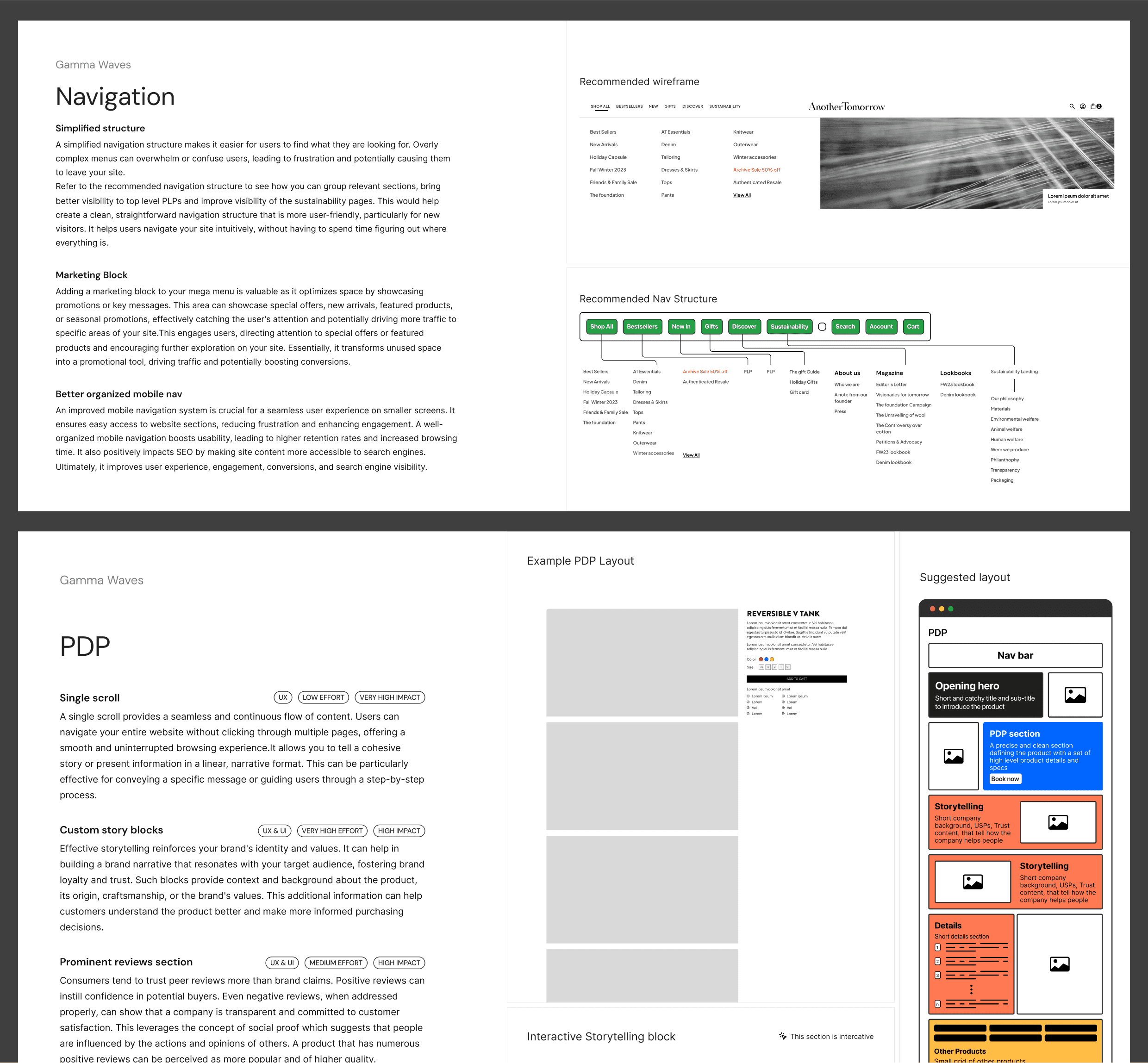
Navigational Nightmare: First-time users felt lost and frustrated, hindering exploration and purchase intent.
Personalization Void: Finding products tailored to individual needs was a struggle, making the shopping journey impersonal.
Hidden USP: The unique selling proposition of traceable QR codes wasn't readily apparent, diminishing its value.
Inconsistent Experience: Product pages lacked uniformity, and storytelling elements varied wildly, confusing users.
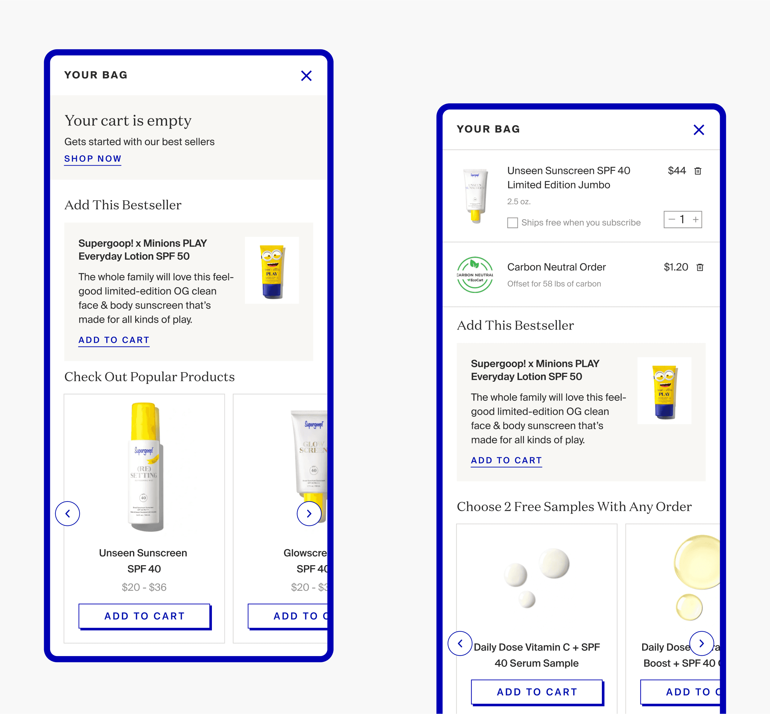
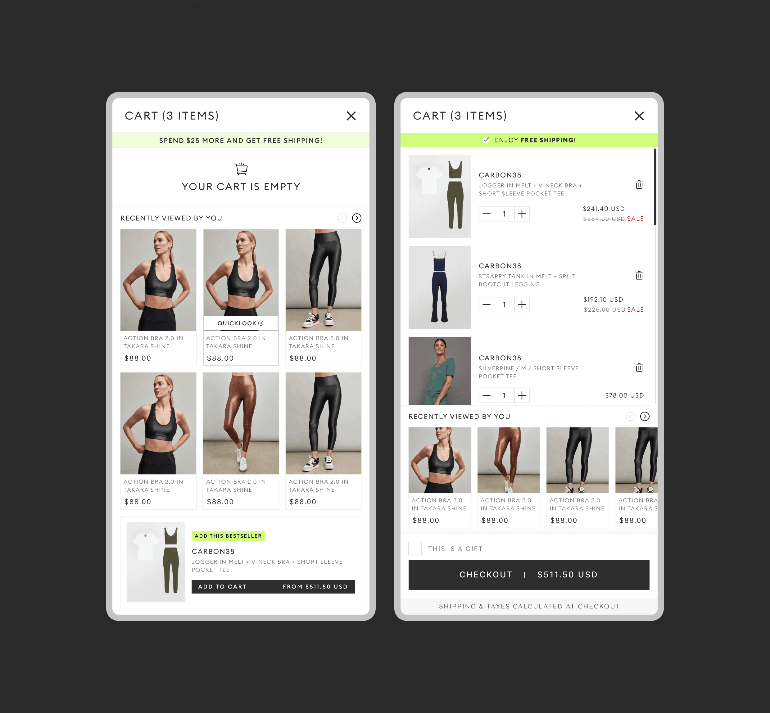
Checkout Obstacle Course: The checkout process offered no incentives or cross-sells, leaving potential revenue untapped.
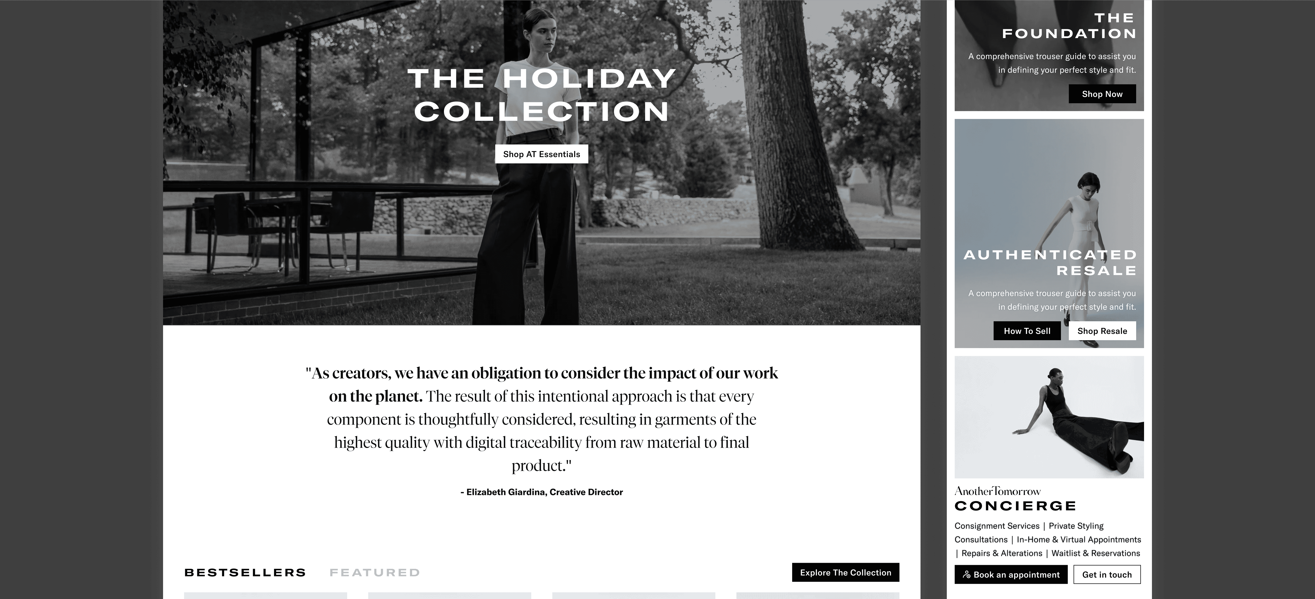
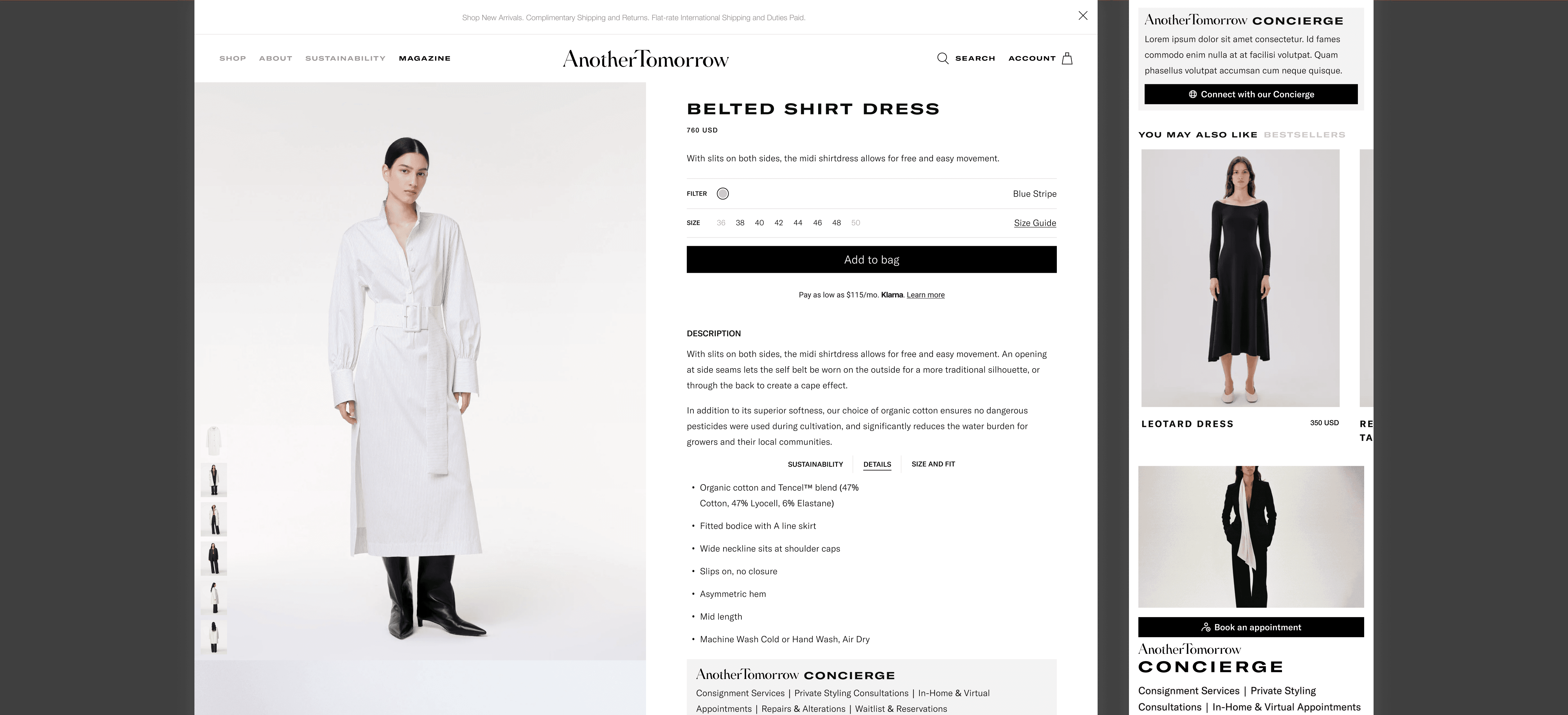
We used the UX audit to expand on these issues, along with a multitude of smaller ones, and created a game plan on how best we could improve the site.To check the accuracy of the audit, we decided to implement a few changes that we considered quick wins. These included things like a revamped PDP, a better homepage, a seamless checkout experience, and added storytelling blocks that emphasized the concierge service.
A glimpse of the redesigned homepage based on the audit, Notice the clearer story telling and well defined CTAs
Impact.
The impact of these data-driven changes was nothing short of remarkable. Within 30 days of launching the updated website, we witnessed:
A 59% surge in sales – a testament to the improved user experience and conversion rate.
A 71% jump in total orders – indicating increased engagement and purchase confidence.
A staggering 91% increase in conversion rates – soaring from 3% to nearly 6%
This case study serves as a powerful reminder: prioritizing user experience isn't just a good practice; it's a strategic imperative that can unlock significant business growth. By understanding user needs and implementing data-driven solutions, we can create websites that not only delight users but also drive tangible business results.
