Carbon38
Rapid design updates to boost sales for a high-fashion activewear brand.
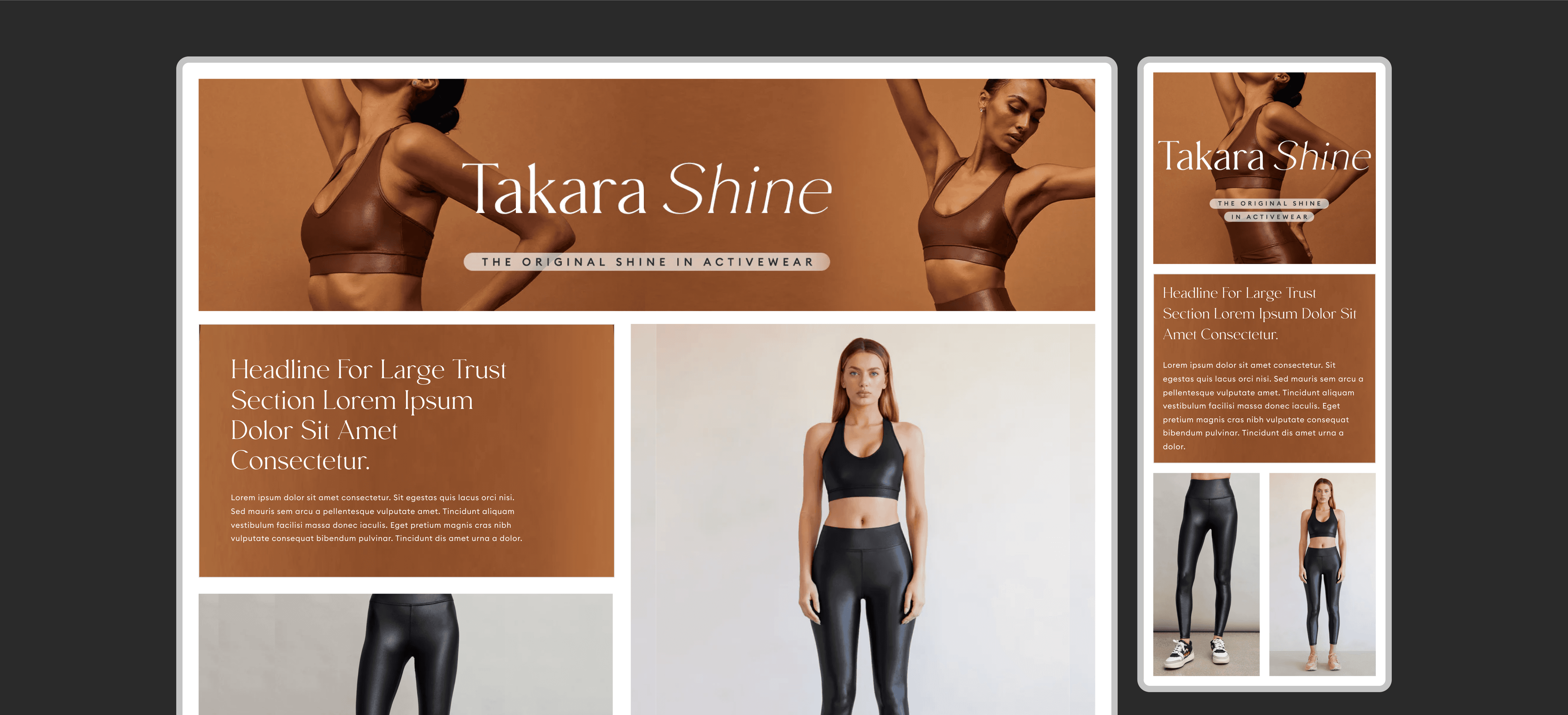
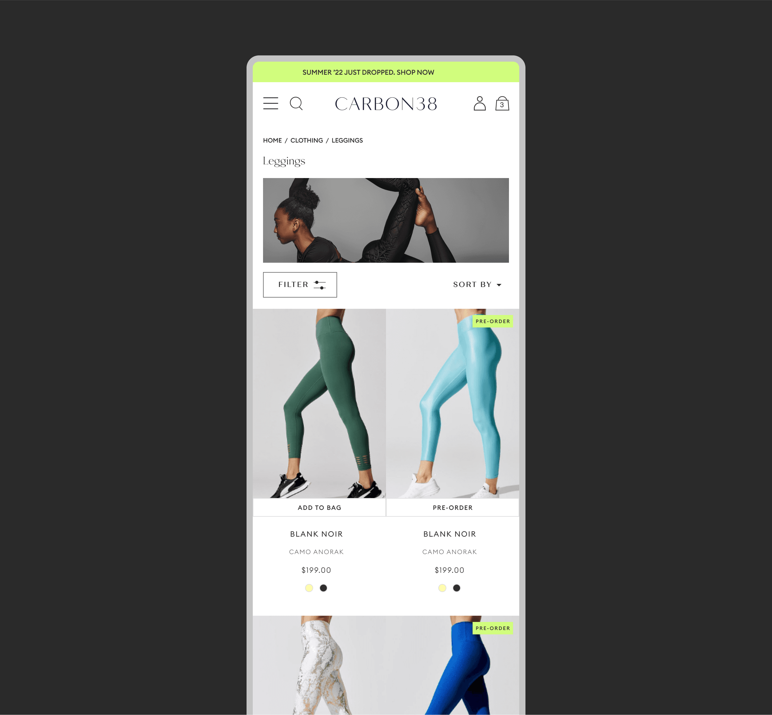
Founded in 2012 in a one bedroom apartment by Katie Warner Johnson and funded by the Winklevoss twins (yes, the 'social network' twins), Carbon38 is a women's high-fashion activewear and ready-to-wear brand with the main goal of bringing fashion to function. The brand is known for its revolutionary products like the fitness line 'Takara Shine' and award-winning partnerships with industry leaders like Curtis Kulig, Jonathan Simkhai and THE Venus Williams. Carbon38 approached gamma waves to carry out rapid, high impact updates to elevate the consumer experience. Being the lead designer in this project, i created a punch-list of items that we could work on that would improve the experience of customers visiting the site thus increasing the overall shopping value on the site.
Background.
The motivation for the soft rewamp for carbon38 didn’t happen overnight. Since the start, C38 only had means for users to purchase products by exploring the site themselves with no personalization
For the design team, we were always supporters of the initiative to improve accessibility and follow industry best practices. In 2021, we were all excited to see light mode make it onto the roadmap — while also knowing it would be a difficult challenge with many constraints and considerations.
Approach.
As the lead designer on this project, I pursued two main goals:
Creating a scalable system: One that our design and engineering teams could easily follow.
Designing the best possible experience: For the end user.
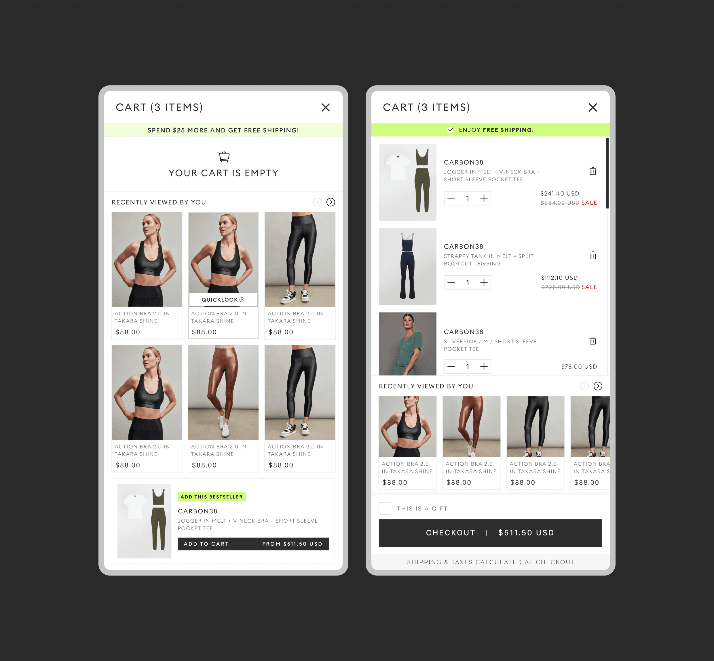
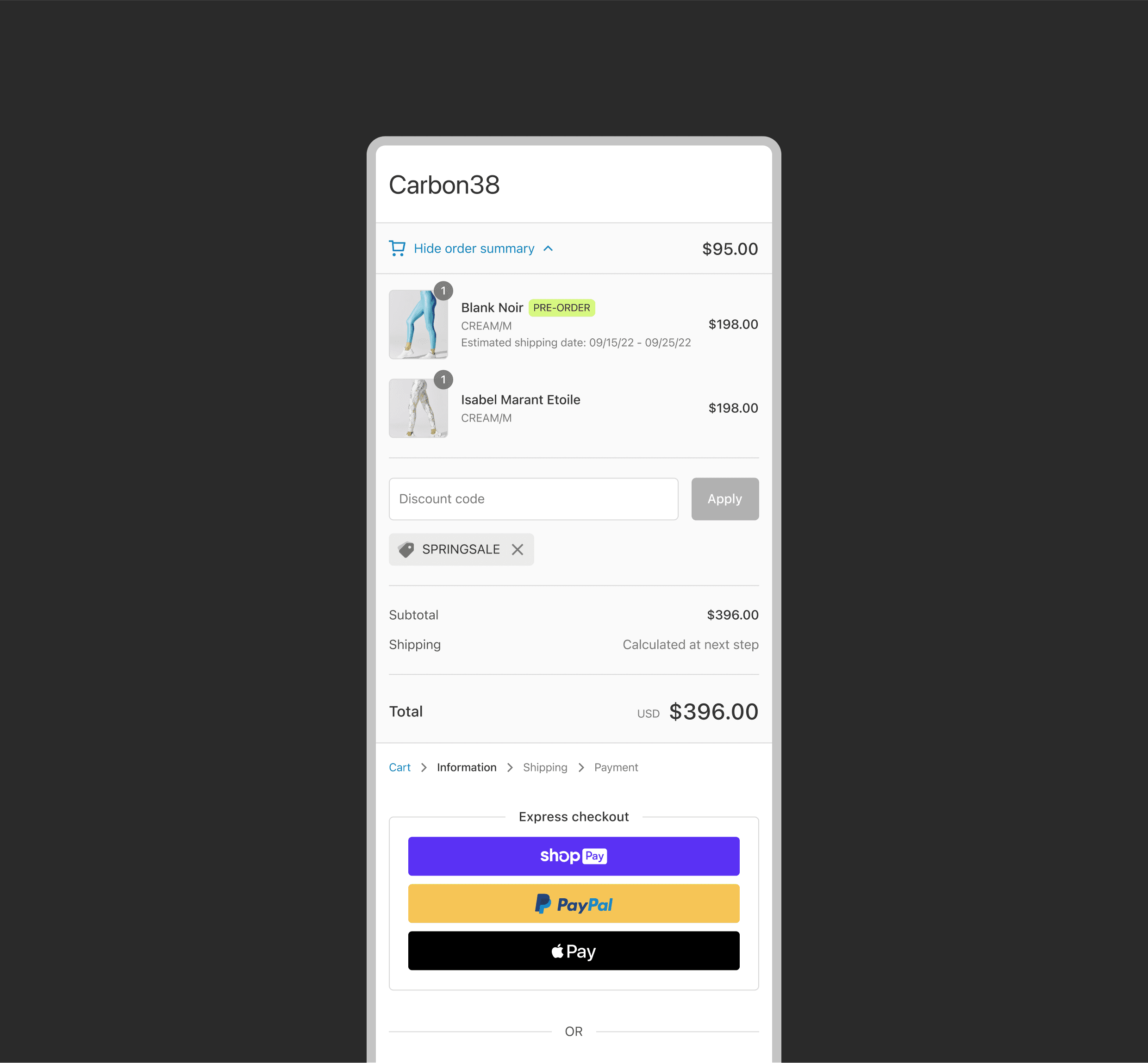
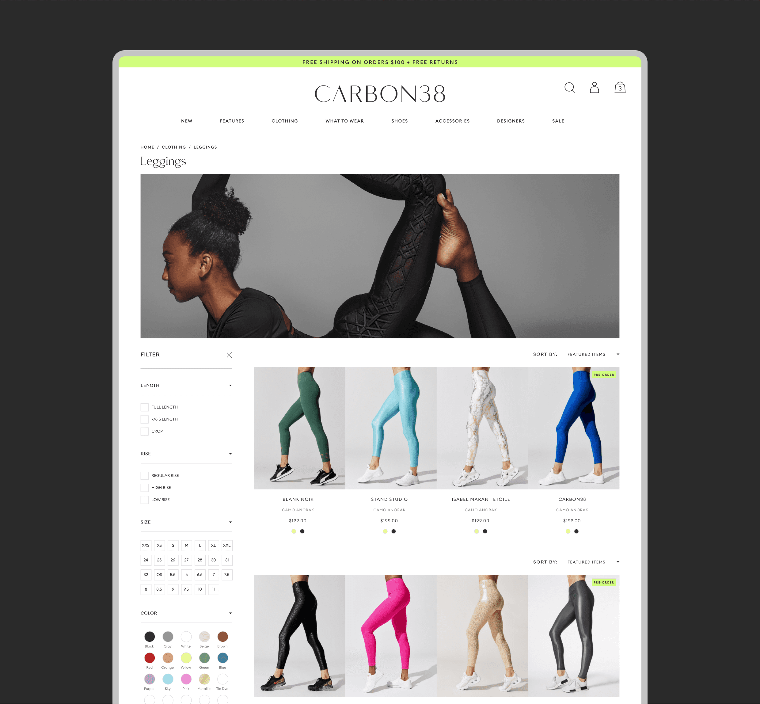
I sought approaches that could be implemented quickly, minimizing excessive user research time. This resulted in a comprehensive roadmap of features, prioritized by their perceived impact and implementation time. The final list included features such as:
Cleaner navigation
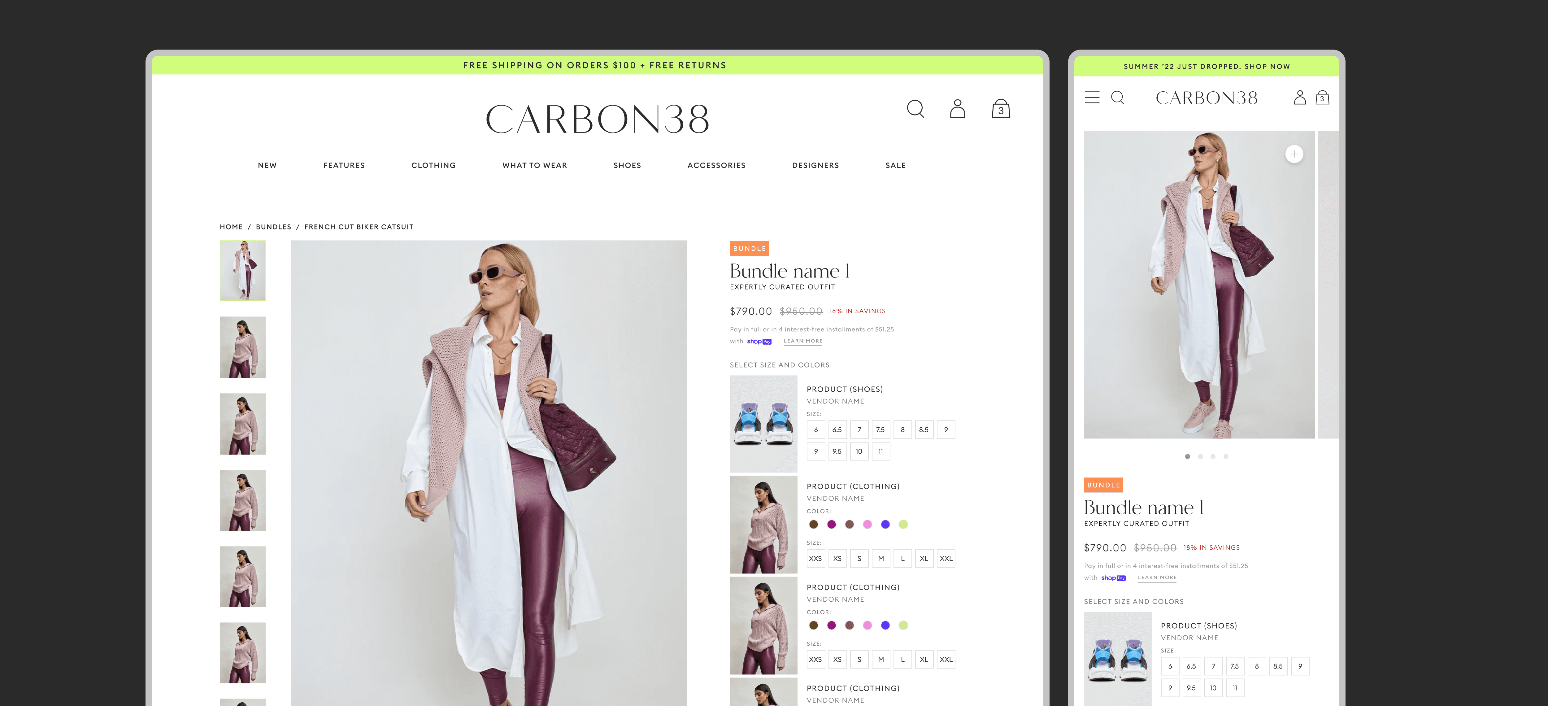
Bundles
A revolutionary "Shop the look" feature
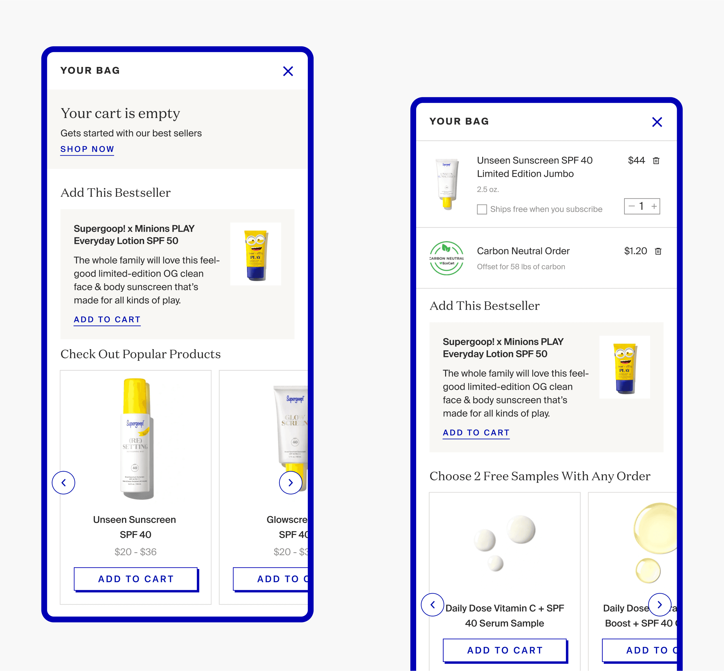
Recently viewed items in the cart
Product tags
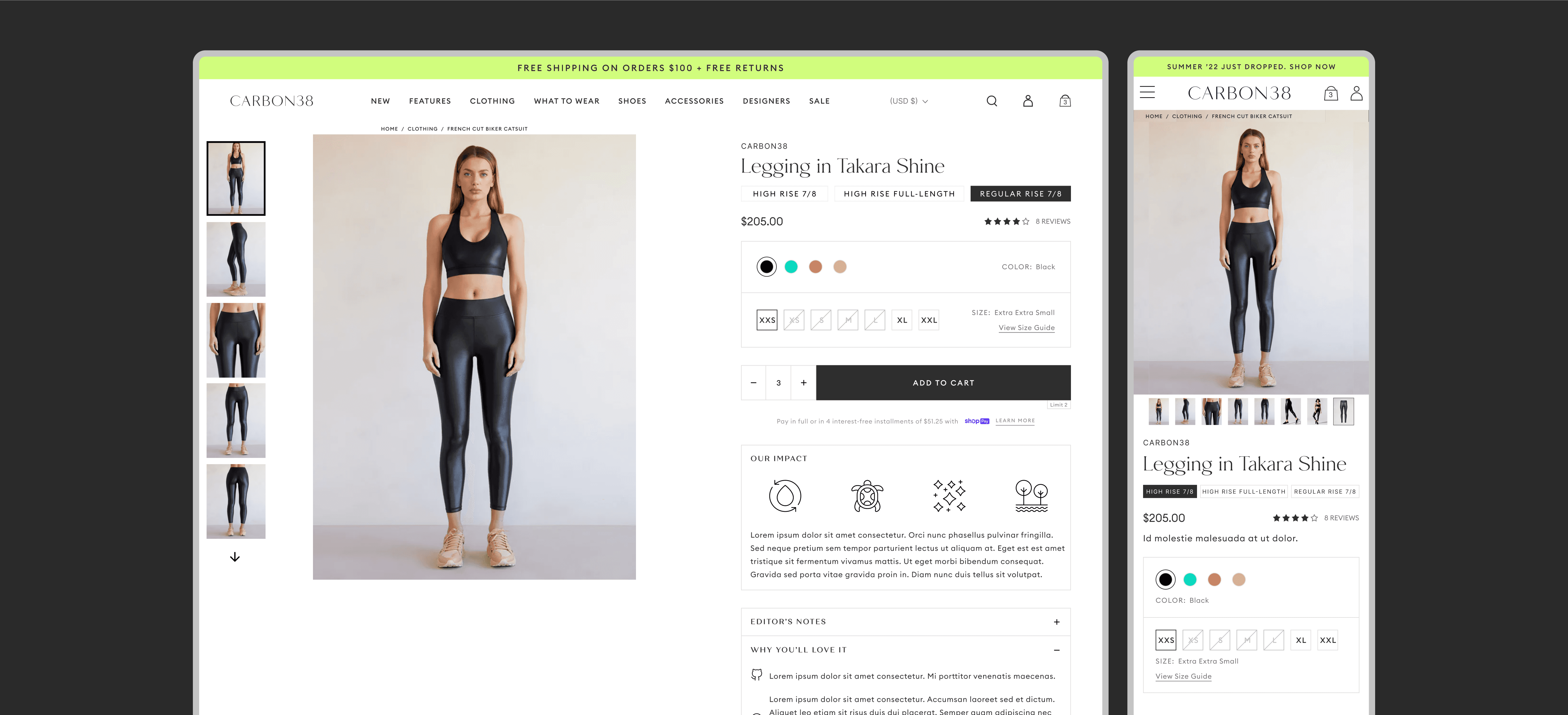
Revamped PDPs and improved storytelling blocks
I chose these as the primary items to update because they are a part of the site's main user interaction points and would therefore improve engagement.
Impact.
After a month of designing and iterating and the impact of the final designs were significant and immediate. There was a direct increase in conversion sales and the total number of orders in a timeframe of a single month. There was also an increase in overall user engagement by over 40%.
Some key takeaways from this project are:
Prioritize impact through an MVP: Remember, time and resources are limited in these projects. Start with features offering the greatest value to users, ensuring the biggest bang for your buck.
Refine the core, not aesthetics: obsessing over UI details early on doesn't help. Stepping back and focusing on user flows shifted my focus to UX, resulting in a stronger foundation.
Stay problem-focused: It's easy to get bogged down in daily tasks. Never lose sight of your users' pain points. They are the core problem you're solving, so keep them at the forefront of your decisions.
