FEKKAI
A game changing redesign to boost recurring revenue.
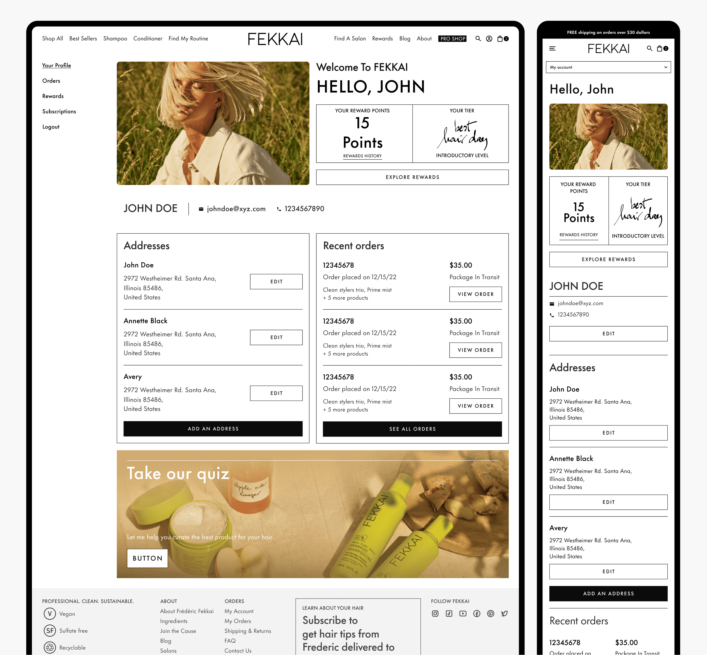
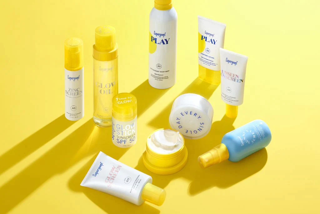
FEKKAI, a luxury haircare brand founded by French celebrity hairstylist Frédéric Fekkai, prides itself on being highly sustainable. They focus on creating clean products with natural ingredients while maintaining exceptional effectiveness. FEKKAI approached Sellry (now Gammawaves), where I serve as the product design lead, to build a new website from scratch, completely replacing their previous one. Recognizing the brand's value and target audience, we aimed to design a website that reflects their commitment to sustainability while highlighting product effectiveness, packaging, and the natural ingredients used.

Background.
Crafting the Fekkai website seemed straightforward: A familiar e-commerce flow, but supercharged with captivating content that focused on sustainability and extremely compelling recurring revenue features like subscriptions based on interactive questionnaires. We envisioned stories that would weave through the shopping experience, connecting customers with the Fekkai brand and its values. A well-defined rewards system would incentivize repeat purchases, creating a loyal base. But a hurdle emerged.
The client had pre-existing designs, developed elsewhere, that didn't align with our shared vision for the Fekkai brand. While lacking the storytelling focus and crucial elements we (and much of the Fekkai creative team) deemed essential, the client, despite agreeing with our concerns, faced a tight deadline and sought our solutions.
Approach.
To address the challenge of tight deadlines, we leveraged a familiar e-commerce flow based on Jakob's Law, which states that users prefer interfaces consistent with their prior experiences. This maximized user comfort and reduced learning time.expand_more
Understanding User Behavior:
Through an in-depth industry analysis, including competitor analysis and interviews with frequent Fekkai salon visitors in New York, we gained valuable insights into user behavior and motivations for repeat purchases. Key questions explored:
What motivates people to use Fekkai products?
How do people feel when unable to access a Fekkai salon?
What demographics do these customers represent?
What are their motivations and pain points when purchasing and using personal care products?
What is their interest in a subscription service for Fekkai products?
Key Findings:
83% of salon visitors loved the products and services and expressed a strong desire for continued use, regardless of location
78% experienced frustration due to product unavailability outside of salons
The primary demographic for Fekkai services was 35-54 years old (45%), followed by 25-34 (41%).
This consumer group expressed a high desire for personalization with moderate involvement.
59% desired to have an hands off experience in purchasing the products.
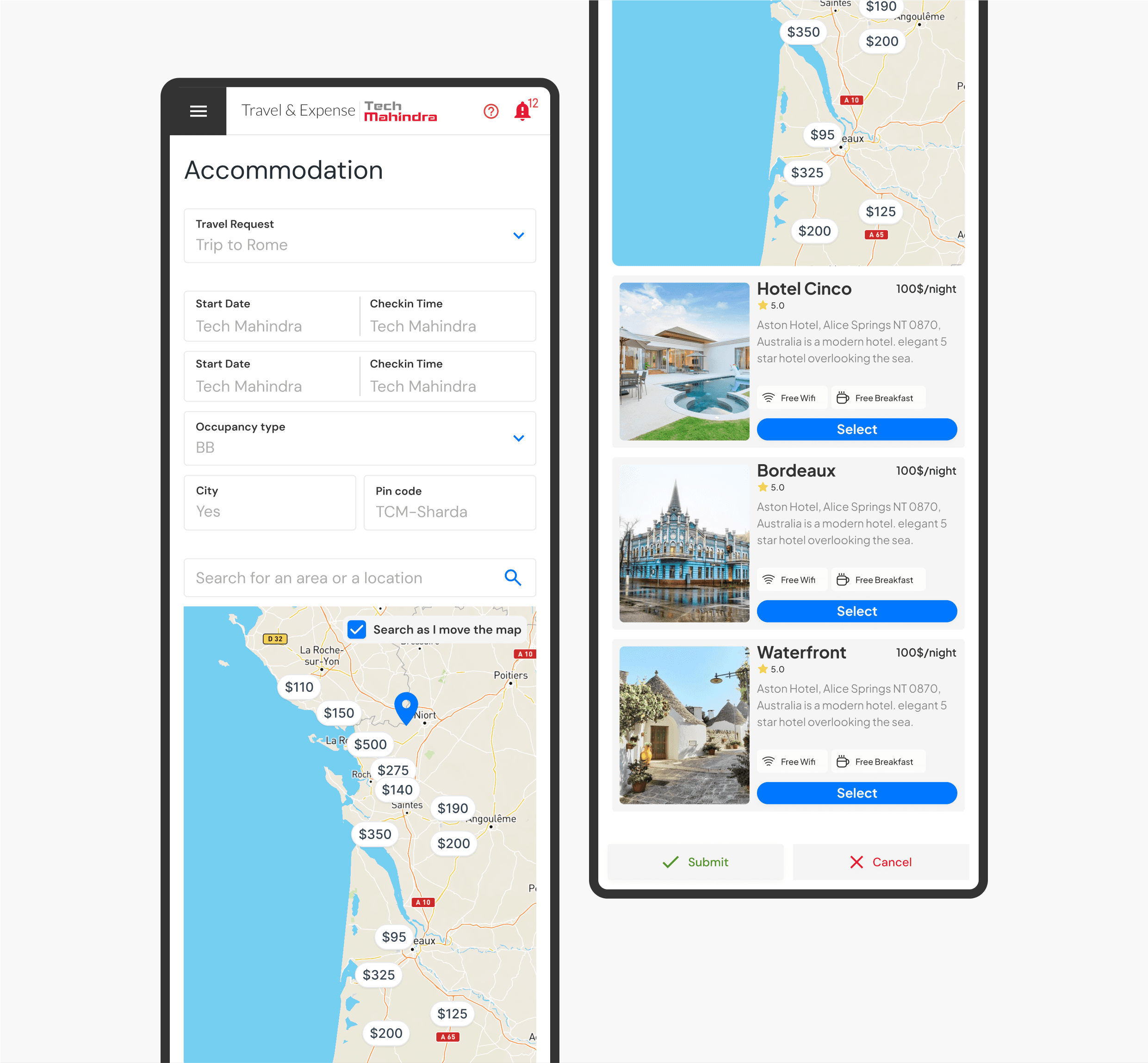
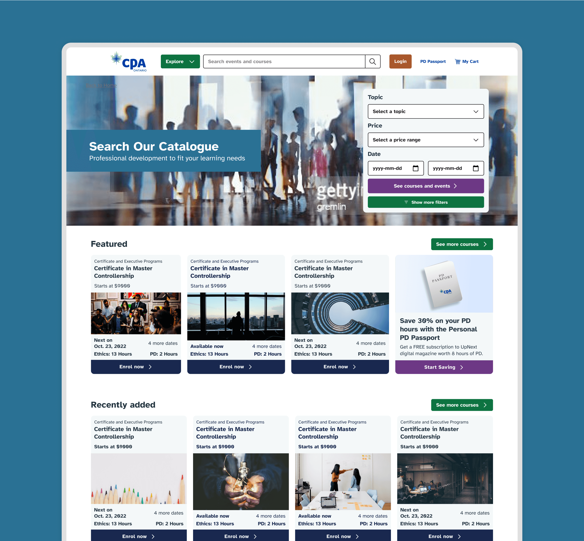
Armed with these insights, we began crafting quick and dirty wireframes to establish the structure for various site pages. Our idea was to create an experience that felt like a digital extention of the salon where people could get exactly what they needed whenever they needed.
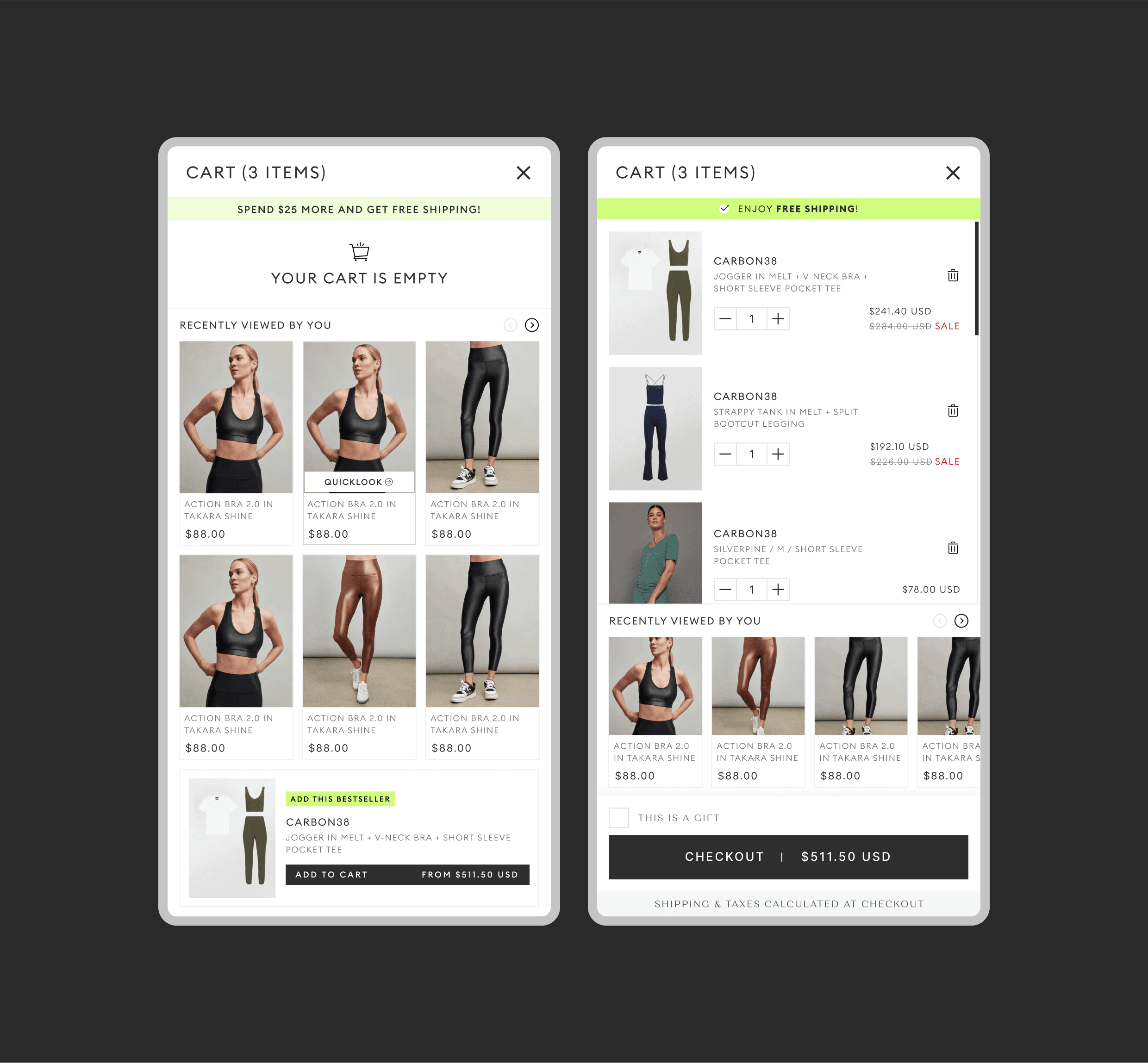
We created an extensive component and interaction system that allowed us work in conjunction with the developers. This allowed us to reduce the turn around time significantly and create effective designs at a very high speed.
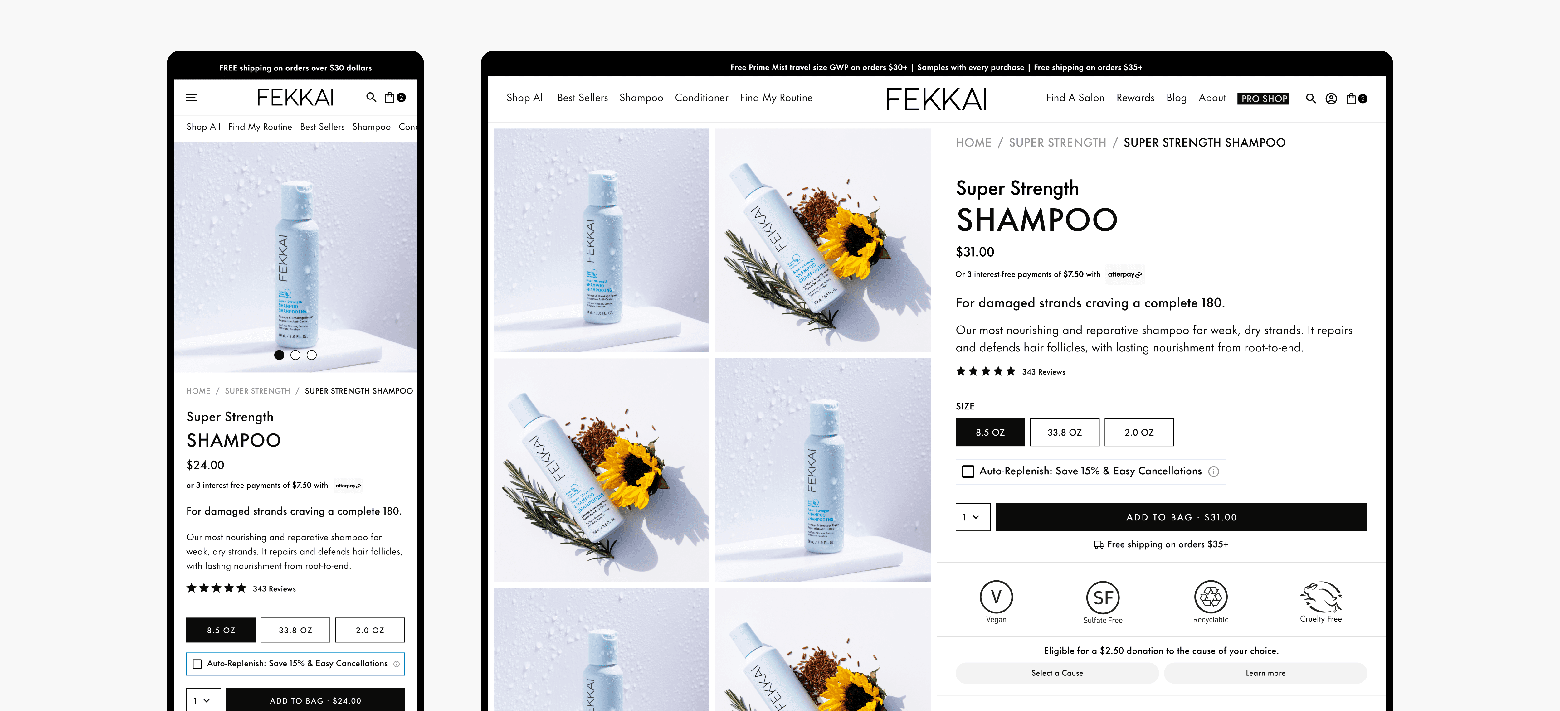
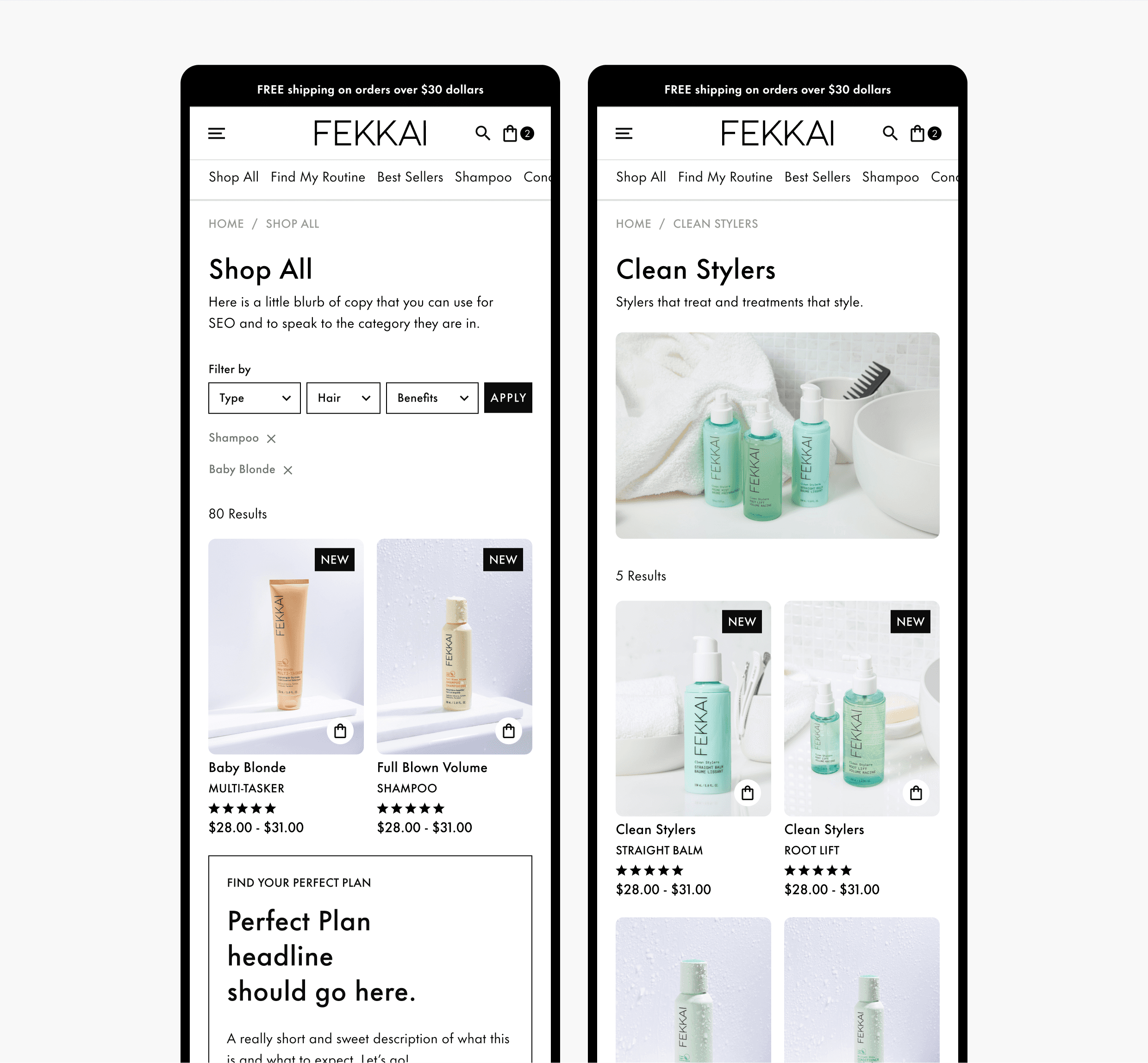
A glipse of the PDP that emphasizes on the product and recurring revenue features
Impact.
Despite the rapid design, development, and deployment process, the results exceeded our expectations. Within 12 months, the website generated over $1.7 million in sales, with a steady conversion rate increase and over 30,000 orders in just six months.
Following this success, we conducted a retrospective brainstorm session to identify best practices for tackling projects with tight deadlines while maintaining quality. Here are some key takeaways:
Find inspiration everywhere: Even though the original designs didn't align with the brand image, they offered valuable ideas, particularly the straightforward implementation of quizzes.
Work hand-in-hand with the dev team: Collaborating closely with developers, as demonstrated by our design system using reusable components based on their feedback, allowed for fast delivery without compromising quality.
Have UX frameworks ready: For projects with tight deadlines, having a bank of generic user flows readily available offers a time-saving solution, while also allowing for deep customization based on client needs.
